tipiblu, ¶ Siamo una boutique creativa che realizza progetti di comunicazione visiva, valorizzando l’unicità del cliente. ¶ Siamo rigorosi, ma non rigidi.
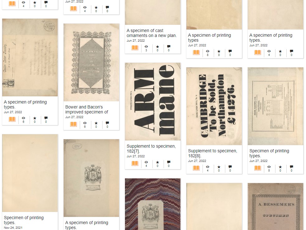
The @stbridelibrary has been digitizing parts of their amazing collection so it can be accessed online.
It spans from 1616-1830, representing the leading foundries of the time including Caslon, Figgins, Thorowgood, Thorne and Didot.
Check it out here: https://t.co/A2MHyWBh3B
New Release: the official custom font of #MilanoGraphicFestival identity, designed by Fabrizio Falcone, is now available in our Studies Collection!
Read the story behind the design and buy it! #MGF22#milano#design
https://t.co/b3C4lzlMEU
SAVE THE DATE: Friday, 11 February at 14:15, our Riccardo Olocco will talk about "The trade in type in Venice in the early decades of printing". You can book your participation here: https://t.co/rH8PcE3Xng
@UniofOxford
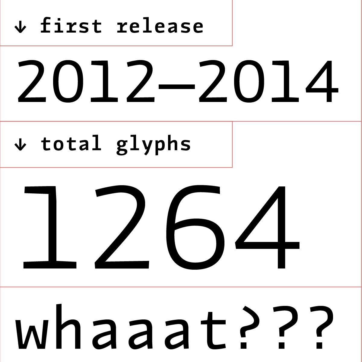
Jantar Flow is our latest release. Designed by Radeck Lucasiewicz, is an #humanist#sanserif, tailored for continuous reading. Check it out https://t.co/RexxlNBVEu
Spreading the type! A long blog post on our half magazine half #specimen Cast It. A four issue journey with @LazyDogPress and many contributors: from @jamesclough6 to James Mosley, to @typeoff and Sébastien Morlighem… https://t.co/PzbOQeSdmJ
And something new is coming! Thanks to @PaulShawLetters for his essay and Paola Fortuna with Federico Conti Picamus, for this new adventure: https://t.co/6NWtHyJVym
TXC Pearl is the new #font for cast foundry’s studies by Andy Anzollitto: an interesting study on Texan XIX century #type. Read more on https://t.co/Im8eLA0Tk4
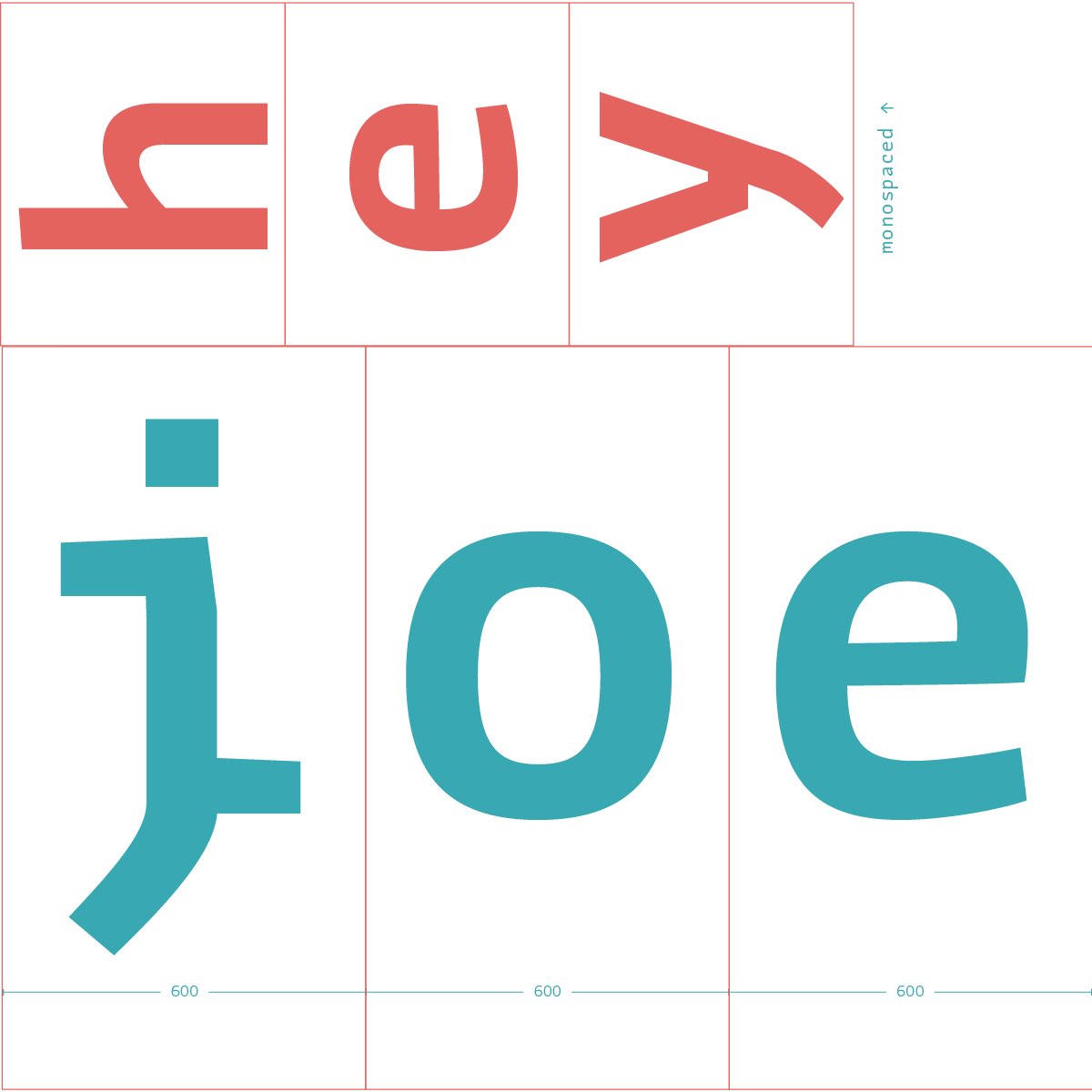
We love to play with #opentype alternatives but follow idealistic history model... read more on the develop of #sempionegrotesk on @castfoundry website!
-> https://t.co/gN88o3Gbyq
@MSilvertant We may suggest Fulmar by @HelloLeo, published by @castfoundry? I think it’s a wonderful Scotch and a brilliant font! https://t.co/TyIS5PTsfQ