Annita Lucchesi's map was part of #GuerrillaCartography's first atlas, #FoodAnAtlas, which was a crowd-funded success in 2012.
We're now getting ready to publish our third atlas, Shelter, but we need YOU to help us fund it! Kickstarter link goes live in 2 days! #ShelterAnAtlas
I've published another @observablehq notebook about the harmonic series with a short introduction into additive sound synthesis.
https://t.co/JE8O6tdVrS
@wahlatlas@mxfh Ja, ist viel besser, auch wenn nicht flaechenproportianal. Da es eine Transverse Mercator Projektion ist, sind die Abweichungungen aber minimal und spielen bei dem Massstab keine grosse Rolle.
Today is the launch of this two-and-a-half-year investigation examining the role of women in the workplace. Women are missing from positions of influence that shape this country. It’s more than a wage gap. It’s a #PowerGap. https://t.co/T9PInHGV9O
Happy new year everyone 🥳 As a new year's resolution I've decided I would try to do even more dataviz. To start of with I've put together a portfolio of my past work. Hopefully you will discover something you haven't seen before. Check it out ➡️ https://t.co/NvCuVzWTsq
✨ Excited to launch:✨
~ WAVES OF INTEREST ~
Tracing Google Search Interest
in US Election Years
https://t.co/iF8VwZTgS7
w/ @recifs @destrysibley @googlenewsinit@albertocairo@smfrogers
🧵👇
☕️Lo-Fi Player is a virtual room in your browser that lets you play with the chill VIBE! Share your room if you like it! It's my intern project @GoogleMagenta w/@douglas_eck@_coenen@notwaldorf@fjord41@hardmaru
🤙play https://t.co/7z91upQkh1
📖blog https://t.co/zE93SofY3b
1/
A decade ago I saw #GabrielOrozco exhibition @MuseumModernArt in NYC. Every now and then I think about his work.
Here is a programmatic recreation of one of his piece of art.
🔖 @observablehq notebook available here https://t.co/ceoizlVd5y
The intrinsic patterns of Cellular Automaton rules are usually visualized using a grid of black and white squares. Here is a different way to realize the structure within these rules. 1/11 (Also available as an article here: https://t.co/wpEeQ8sQK1)
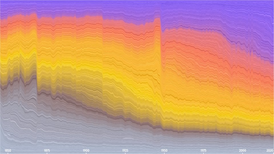
✨ New project alert! ✨
We visualized the @sciam archive — 5’107 editions from 175 years containing over 100m words!
Thanks @laesser @ChristiansenJen @JenLSchwartz for the great collaboration! 🙌
(Thread)
Really enjoyed this UI design Tour de Force by @borism and @frankrausch: Menus, Metaphors and Materials: Milestones of User Interface Design https://t.co/BovbZxB6oq
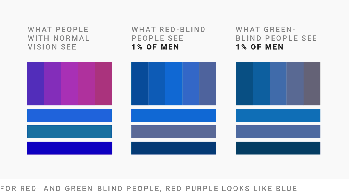
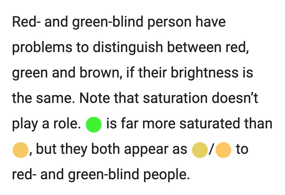
How many of the data visualizations you created are colorblind-safe? All? 90% at least? Hopefully?
Personally, I don't know.
I wrote a blog post to make you (and me!) care more. It's the first article in a 3-part series on colorblindness. Find it here: https://t.co/rAjUKWhOUN
I've published an interactive & editable article with more details on how to create perceptually smooth CIELAB spline gradients:
→ https://t.co/T4vHGW0EnQ