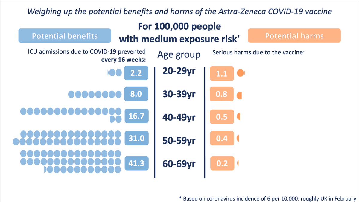
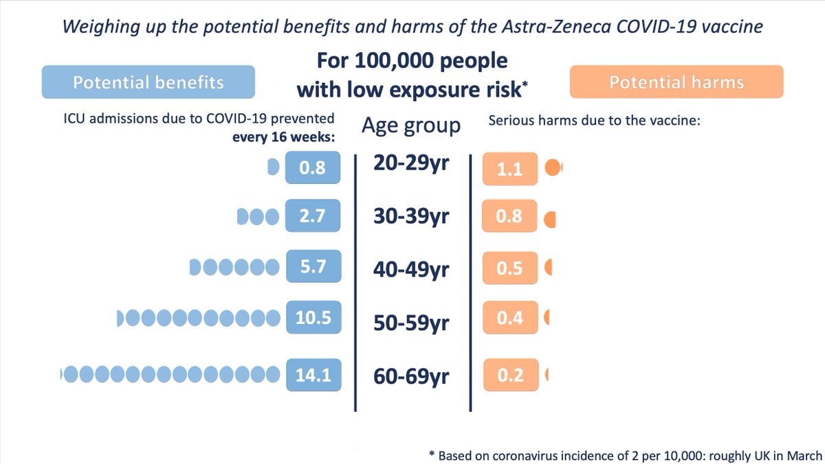
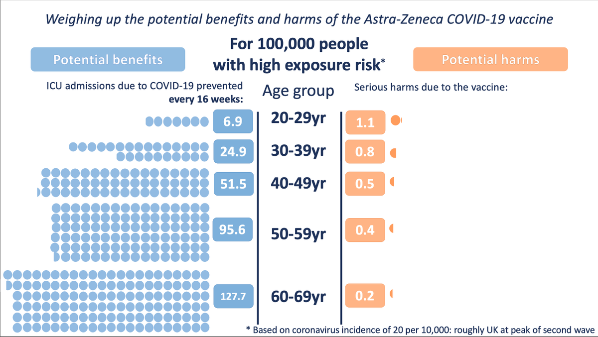
Our graphics to illustrate the potential benefits and potential harms of the AstraZeneca vaccine as announced by the MHRA this afternoon.
Benefits accrued over 16 weeks, at three different levels of exposure to the virus.
@chrislintott Thanks. Mars this evening. We have images of stars with single-site interferometers (e.g. https://t.co/CEbkRUoQqR talks of 1/5 mile to image a star) - fingers crossed an exoplanet can be done - maybe rather more interesting than an image of a star.
@BBCMoreOrLess@d_spiegel Have you noticed we are about to hit an average of one COVID test conducted per member of UK population? Seems of note. Wonder how non-uniform the distribution is.
Very detailed slide pack from PHE and NHS Test and Trace with reasons for every Tier decision
https://t.co/mMhvu9Vijv But it doesn’t seem to turn up on a Google search! Need a good website with all this info there
A dot for each of the 20,283 deaths involving COVID-19 up to 17th April.
Too many of us have loved ones on this map.
Full size here: https://t.co/CrEidUpdeC
Data from today's @ONS release.
Lots of great ground truth in this WHO report on the #COVIDー19: the disease, the transmission pathways, and China’s response.
https://t.co/OypA5WA2Lz
Kudos to the authors on excellent charts that can stand on their own. Makes it really easy to share.