Every four years, the American Society of Civil Engineers (ASCE) publishes a report card about the state of infrastructure in the US.
ASCE partnered with @Esri to create a set of maps to accompany the 2025 report card: https://t.co/m1eaxqJ3ke
This map shows the prime growing regions for the ingredients of America's favorite sandwich - peanut butter and jelly! 🥪 See where these essential components come from and how they make this iconic dish so delicious. https://t.co/WYvVJnJFBl
🗺️ Author: William A. Koelker
See how this map of @NatlParkService lands lets you visualize multiple variables at once. 🗺️ Very demure, very mindful.
Learn how to use the new “quantity by category” capability in ArcGIS Pro. https://t.co/UJNfhQ95ag
#Cartocreativity#ArcGISPro
The US experiences a wide range of natural hazards from avalanches to wildfires, but many impact specific parts of the country. This #animatedmap of data from #FEMA shows which US communities are most at risk for 18 natural hazards. #mapsdotcom
https://t.co/OeOfhvvU7E
How much do natural disasters cost the US? It depends on the disaster and the location.
Our latest map explores 3 of the 18 kinds of disasters tracked by @FEMA's National Risk Index.
https://t.co/xLctOG0NdT
This map from @NASAEarth shows how a weakened polar vortex and 'bomb cyclone' brought sudden cold and snow to the Midwest in December 2022.
https://t.co/sAh1NScxdp
#maps#dataviz
Buses in the United Kingdom complete more than three billion journeys each year.
@CraigTaylorViz gives us a stunning look into some of these buses and their routes.
View the complete series: https://t.co/jz6oRqlThe
#maps#dataviz
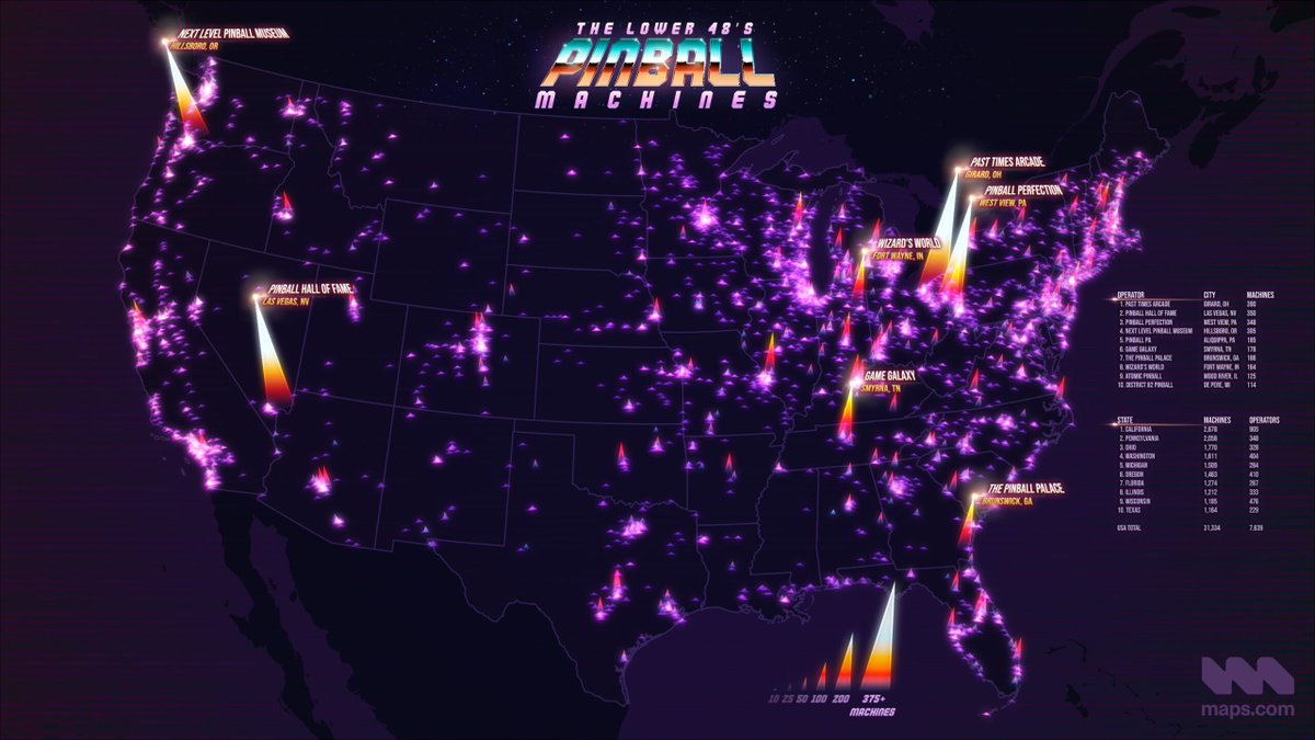
👾 There are more than 7,000 locations operating pinball machines in the US.
Our latest map shows how many pinball machines you can find at each spot.
https://t.co/jDbKKBUjUt
#maps#dataviz#pinball#arcade
A total solar eclipse captivated North America in April of 2024.
But is such an event rare? It depends on your perspective.
Here's 5000 years of total solar eclipses mapped. Learn more: https://t.co/qgENiAMZrt
#dataviz#maps
Despite their relatively small geographic footprints, coral reefs are pivotal for ocean ecosystems and support up to 25% of marine life.
Learn how @Esri is helping us keep watch on ocean health with an interactive map of coral reefs at risk of bleaching: https://t.co/aqAgrRX4s7
#maps #dataviz #oceans
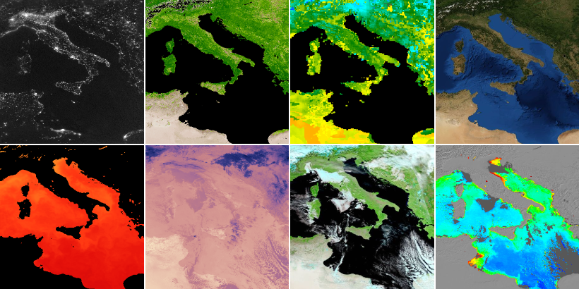
What if you could see Earth—or any part of it—as it is today?
With @NASA's Worldview, you can. Explore change over time, current conditions, or the simple beauty of our planet.
And optical imagery only scratches the surface of the more than 1,000 data layers available.
Learn more about this incredible tool: https://t.co/JqSj27vQIp
It’s getting warmer across the US each year, but some places are faring worse than others.
Launched in 2022, https://t.co/K9YLZKAzjH helps communities understand, forecast, and prepare for extreme heat and its impacts.
Learn and explore more: https://t.co/qIgb0khdKs
#maps #heat #climatechange
🧵A total solar eclipse will occur on April 8. We’ve rounded up our favorite maps to explore while you wait.
No other map captures the day turning to night quite like this one from @NASAViz/@mappinmickie. https://t.co/OLk7PTDUm9
#maps#Eclipse2024
One week from today millions of Americans will experience a total solar eclipse.
This striking map shows when and where you might see the eclipse—and how much the Sun will be obscured at each location.
https://t.co/Qg1ke1ektk
#maps#Eclipse2024#eclipse#dataviz
🤔Have you ever wondered: "Where in the world do most people live?"
✅Here's our answer, broken down by latitude and longitude: https://t.co/whaly4RNNP
#maps#dataviz#geography#population
182 million tons of dust cross the Atlantic each year. A portion of it reaches & feeds the Amazon rainforest.
📽️ Watch our latest animation of @NASA data showing how dust and other aerosols interact w/ Earth's dynamic atmosphere: https://t.co/rkAW9DoaaE
#maps#dataviz#scicomm
Have you ever wondered how people in the US heat their homes?
Explore the #geography of home heating, with small- and large-scale patterns written all over the map: https://t.co/IXsUnRujwb
#dataviz#maps#energy