@vamsibatchuk@GoogleAIStudio Really enjoying the googleaistudio series. I am tinkering with it myself but overtime in the chat the output just makes the overall code worse.
Do you have any tips that could help?
I don’t usually post about things like this, but this deserves to be called out. Mr. Mahesh @0xdbm @parallelsclub has taken the design work created by me and Ranjit @ranjeetroy4u, added it to his portfolio, and then blocked me here on Twitter. Sharing screenshots below👇🏻
Creating a new page on my website 'Feed'.
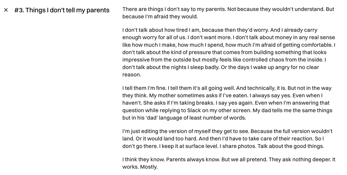
This will be a running log of monologues that don't fit in a blog or tweet.
Here's one of them.
https://t.co/kFOPPXhU3I
We just dropped UX as a title at @Shopify. Same for Content Design. If you design, you're a Designer. If you write, you're now a Writer. Simpler. Better. (1/3)
Jigyaasa mein Jeevan
Sharing the talk I gave at Dr. Narendra Dabholkar Memorial last year. A copy of it already exists on youtube but this one has English subtitles and better sound/video.
https://t.co/qd6f3xQY3I
The most compelling visuals leverage depth to create texture and communicate more than seemingly possible through a flat, still image.
I wrote 1,500 words with over 20 visual examples of using depth for design, animation, and interaction.
https://t.co/JF8gjzI3vs
New guide alert 🚨
Just hit publish on "Component naming manifesto"
It's a rough set of recommendations (opinions!) on how to approach component, prop, and value naming within Figma component libraries
https://t.co/Qf7emHxWrN
I got a rare opportunity to ask OpenAI's video generation model Sora for some videos this week! I had 3 prompts. Here's the videos with my prompts and what I learned 🧵
@shrtsh7 Paradoxically, the work also gets much easier once you have a connection and understanding with other departments.
Designers really need to stop thinking of themselves as a part of digital conveyor belt
Biggest myth designers have is that they don’t need to understand data, tech or business to create great designs.
A world of opportunities open up when you collaborate with the rest of the team and exchange notes. Talk to the stakeholders in your company, your job isn’t limited to pixels.
I've been on a mission lately.
The more that I talk to designers working on ultra-high-quality products...
The more I want to understand what it takes to establish a culture of craft.
After months I'm starting to notice some clear patterns 👇
I love that i can move back and forth between Spaces from my Logitech MX Master 2s using the forward and back button. Thanks for doing that. Not sure what's the equivalent on a regular mouse.
@arcinternet
15 years ago, I helped design Google Maps.
I still use it everyday.
Last week, the team dramatically changed the map’s visual design.
I don’t love it.
It feels colder, less accurate and less human.
But more importantly, they missed a key opportunity to simplify and scale.
–––
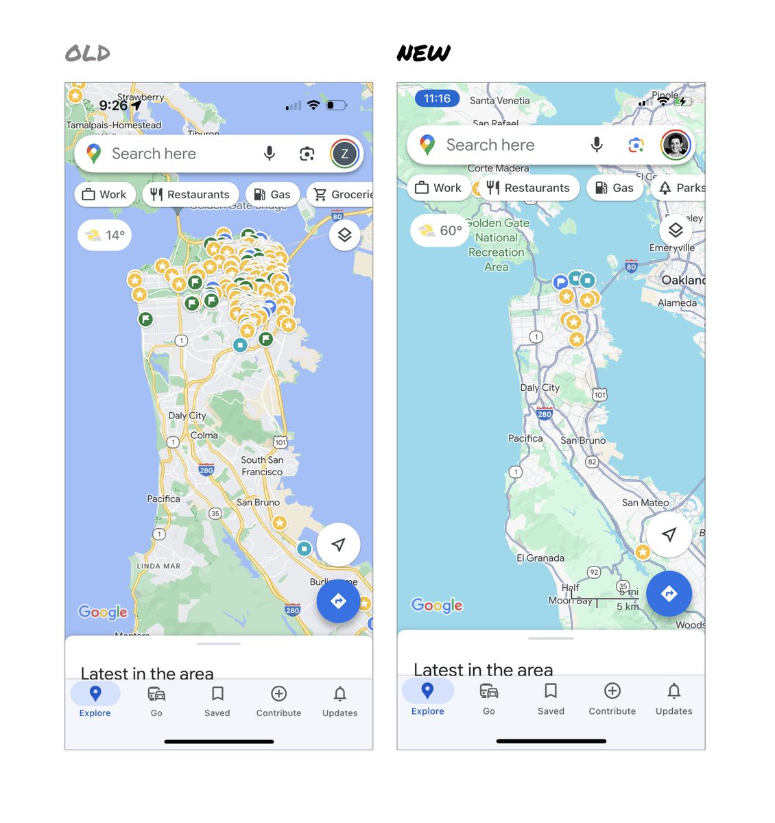
Google Maps has started to widely roll out updated map colors:
- All roads are now gray
- Water changed from blue to teal
- Parks and open spaces are now mint green
It seems the goal was to improve usability and make the maps more readable.
Admittedly, I do think major roads, traffic, and trails stand out more now.
But the colors of water and parks/open spaces blend together.
And to me, the palette feels colder and more computer generated.
But color choices aside…
If the goal was better usability, the team missed a big opportunity:
Google Maps should have cleaned up the crud overlaying the map.
–––
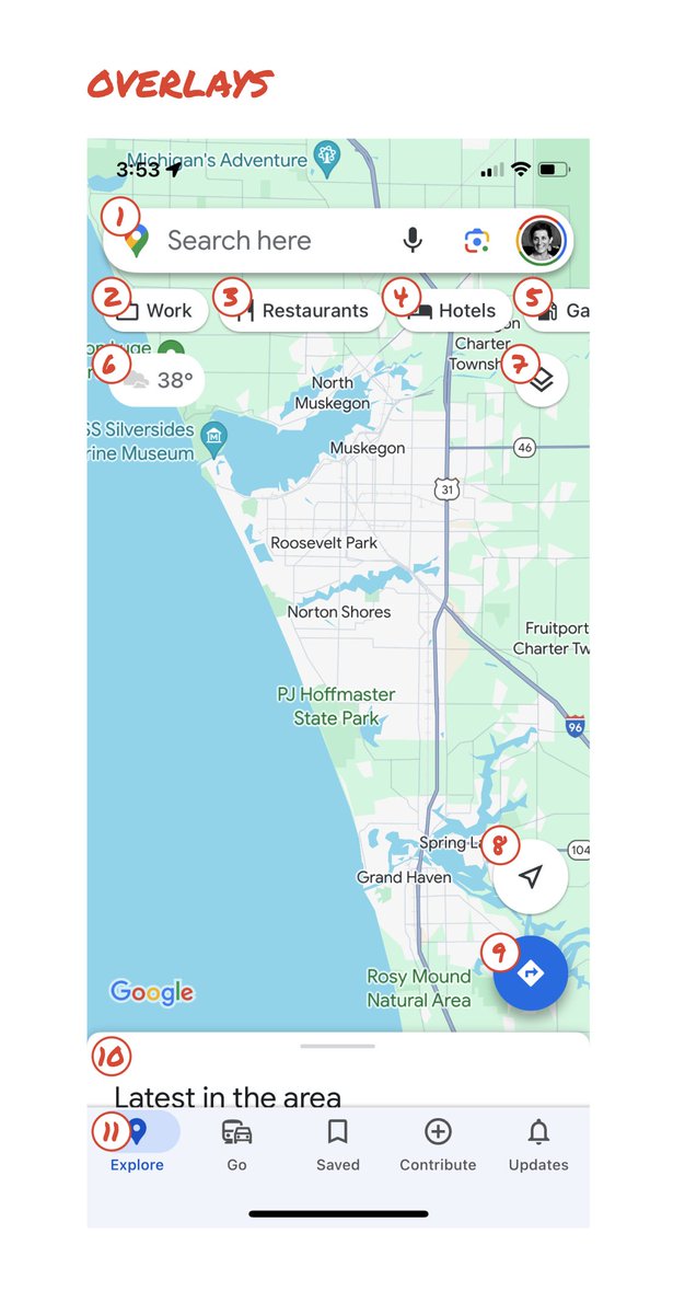
So much stuff has accumulated on top of the map.
Currently there are ~11 different elements obscuring it:
- Search box
- 8 pills overlayed in 4 rows
- A peeking card for “latest in the area”
- A bottom nav bar
(Personally, I would LOVE to see usage metrics for all these overlays.)
The map should be sacred real estate.
Only things that are highly useful to many people should obscure it.
There should be a very limited number of features that can cover the map view.
And there are multiple ways to add new features without overlaying them directly on the map.
–––
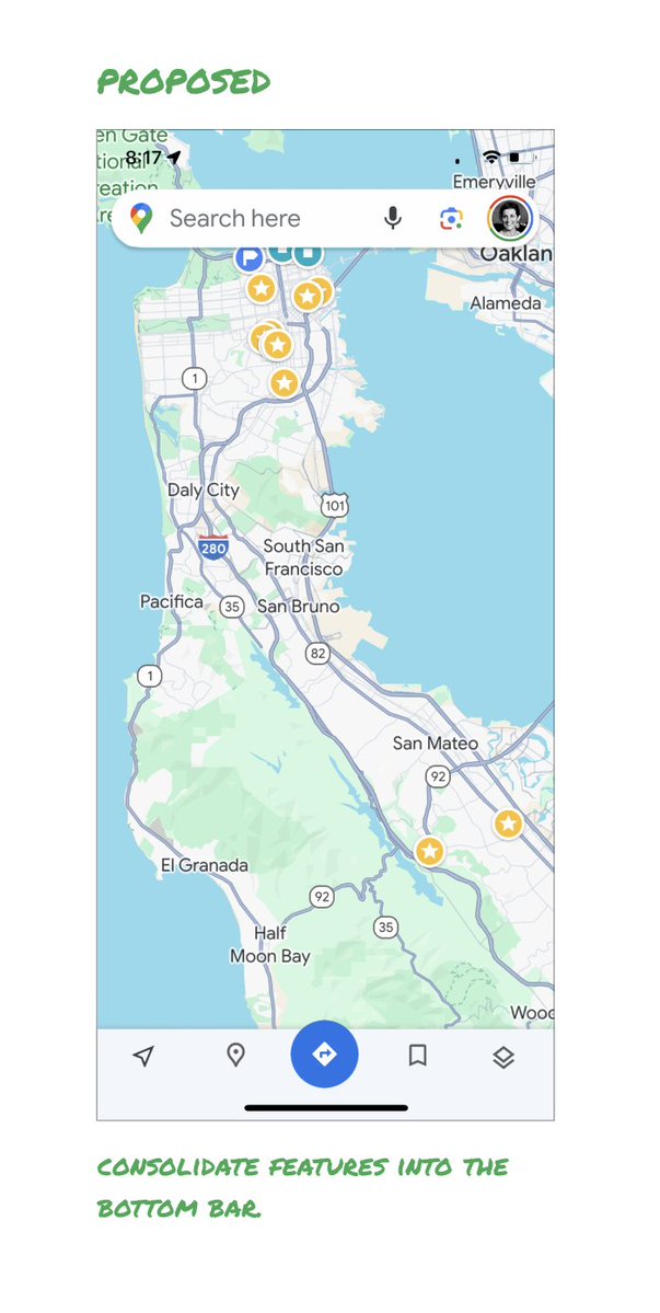
Here’s how it could look:
- Keep the search box
- Keep the bottom bar
- Remove everything else from the map
- Roll the most used features into the bottom bar
- Bury the less used features elsewhere in the app
I assume the search box and directions are top priority and should remain prominent.
My Location and map layers (satellite, traffic, etc.) could move to the bottom bar.
The explore overlays (restaurants, gas, etc.) could live in the bottom bar in “Explore” and open as cards.
The additional space in the bottom bar could be used for Saved, as a “More” option, or could be removed entirely.
There are many variations of how features could be arranged.
But the key points are:
- Dramatically simplify
- Strongly prioritize map visibility
- Bury legacy and low use features
–––
It’s normal for products to accumulate features over time.
But it’s also super important to stay vigilant and continually clean them up.
In many ways, it’s interesting to see history repeating itself.
In 2007, I was 1 of 2 designers on Google Maps.
At that time, Maps had already become a cluttered mess.
We were wedging new features into any space we could find in the UI.
The user experience was suffering and the product was growing increasingly complicated.
We had to rethink the app to be simple and scale for the future.
It seems like it’s time for Google Maps to do this again…
–––
For more on design + tips for early stage founders, follow me on X: @elizlaraki