What comes of 17 years of blogging? For one thing, 675 blog posts.
More importantly, blogging is an outlet for me to explore and document my ideas. To make it a little more searchable and sortable, I created a #juicebox app. https://t.co/kJoPqAhYUF
An interesting 40min talk by @add_hawk titled "The Gamification of Public Discourse." I recommend you watch it! Thanks to @zachgemignani for making me aware of it. https://t.co/fWHssnZZQN
As I think about #datastorytelling - I always go back to mindset and focus on thinking different with data and turning data into an actionable solution with a story? Join us on 9/14 to hear my thoughts on how to change your data mindset. https://t.co/FCrf9Rl8r6
Data is almost always imperfect in some way! One common shortcoming is that data can be OPAQUE: unclear who owns it, who created it, and who's responsible for it. Read this blog post by
@AlliTorban to learn more about it: https://t.co/bHC9DuDTpH
@grosenquist@JuiceAnalytics I like that too. You can't be too explicit in connecting the dots for our audience. Remove ambiguity about what the data is telling you to do.
@grosenquist@JuiceAnalytics “If I look at the mass, I will never act. If I look at the one, I will.” — Mother Theresa
We, the analytical thinkers, think the analytics are enough -- but decisions are made by people, with emotional responses. How can we make the stats human-sized, relevant, and specific?
@grosenquist@JuiceAnalytics Thanks @grosenquist. I've been reviewing 'Made to Stick' by Chip Heath, Dan Heath and it is chocked full of good ideas for moving people to action.
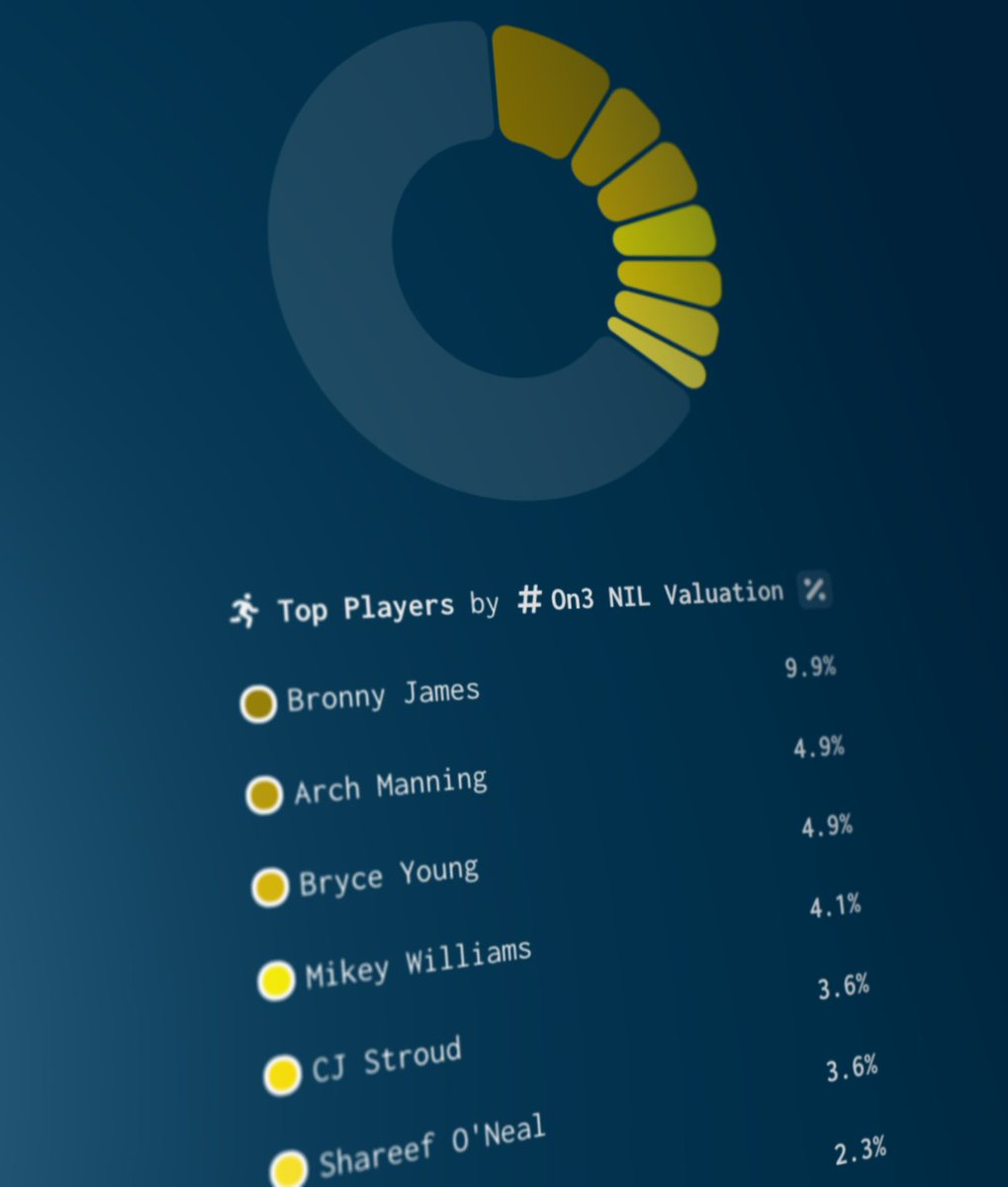
Name, Image and Likeness (NIL) business for college athletes is going crazy!💰💰💰 @on3 has been tracking the escalating value of top athletes in college and high school. I put their data into a more visual, exploratory form. #nil#datastorytelling https://t.co/zyxl6UK65k
🥧 Pie charts are the 🎷 Kenny G of visualizations: Massively popular even in the face of withering criticism.
I used to spend time criticizing pie charts. But why? It is like criticizing Wonder Bread or PowerPoint. So we made a better pie chart
https://t.co/MYm6gJ6aeC
Data is key when it comes to tracking results, proving the value of our efforts, and strategically pitching our news.
@JuiceAnalytics is here to make presentations and data visualizations that much easier. Here's the breakdown on why you should use them: https://t.co/D2Rl9mhkiB