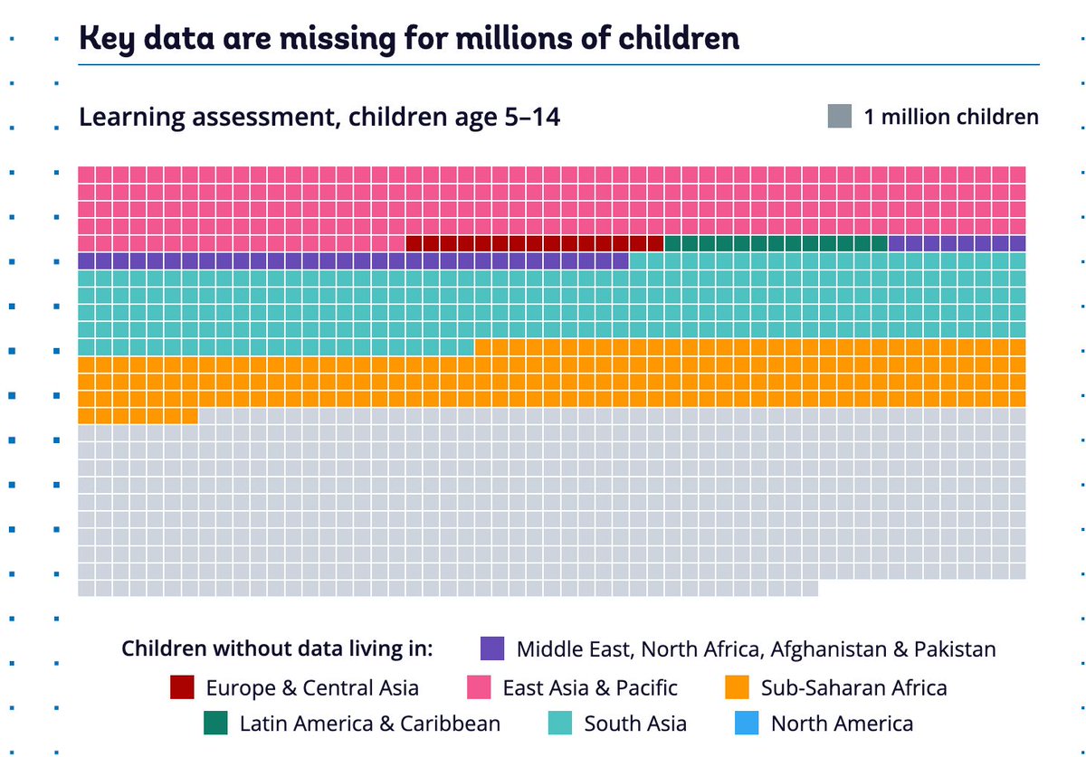
In nearly 6 out of 10 low- and middle-income economies, the latest poverty survey is more than five years old.
The Atlas of Global Development 2026 explores what weak and outdated data systems mean for development policy and decision-making: https://t.co/X6u22BPiYi #WBGAtlas
In 60% of low- and middle-income economies, the latest #poverty survey is more than five years old, making millions of people statistically invisible to policymakers.
This is also reflected in civil registration systems. For example, 195 million children under five, about 30% of all children in this age group, are not recorded in birth registries.
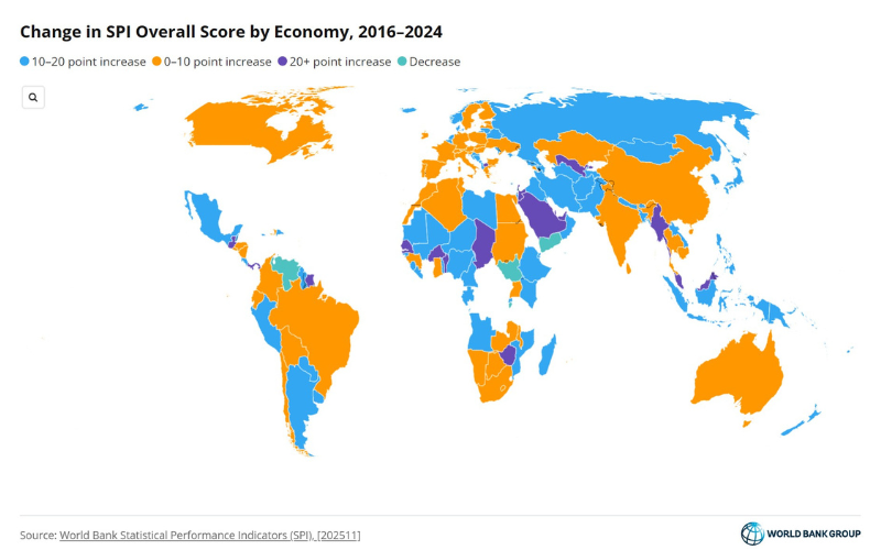
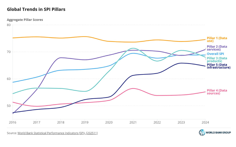
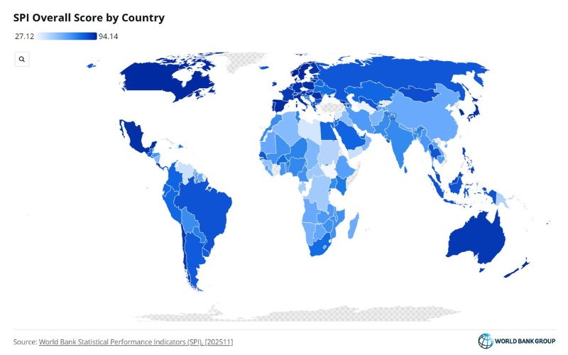
To better understand and address these gaps, the @WorldBankGroup Statistical Performance Indicators (SPI) assess statistical systems across five key dimensions: data use, data services, data products, data sources, and data infrastructure.
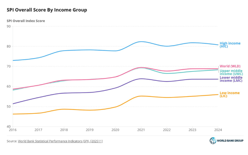
They show that countries with the lowest overall performance tend to score particularly poorly on data sources, reflecting limited capacity to generate and leverage data.
Strengthening institutions, creating the right incentives, and fostering sustained investment in statistical systems are critical to ensuring no one remains invisible.
Explore the new @WorldBankGroup Atlas of Development Data to see how stronger statistical systems can support more inclusive and effective policymaking:
https://t.co/Qe2A1JY3GI
What if inequality is higher than we think? Household surveys often miss the richest households—creating a gap with national accounts.
New evidence explores what happens when we adjust for the “missing rich."
➡️ https://t.co/iC0RuCxh0X
Measuring inequality isn’t just about data—it’s about who gets counted.
If the richest households are missing from surveys, the picture changes.
New evidence shows how much it matters 👇 https://t.co/ojaToBhbNT
Should #poverty be measured using income or consumption data? What about household economies of scale?
By making methodological choices visible and comparable, our PIP Innovation Hub strengthens the evidence base for poverty analysis.
See how: https://t.co/7CqOUppPTh
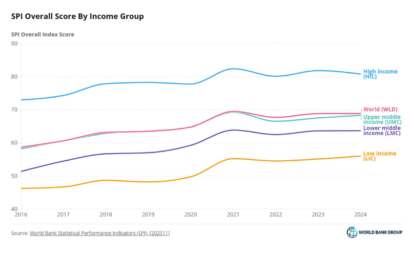
JUST OUT: the @WorldBank’s latest Statistical Performance Indicators (SPI) update helps countries diagnose gaps in their statistical systems & track progress across data use, services, products, sources, and infrastructure.
Learn more: https://t.co/tz5ocTsNPG
Did you know we measure how well countries do data & statistics?
The @WorldBank’s new Statistical Performance Indicators update paints a clear global picture: after strong gains before 2021, statistical performance has largely stalled since COVID-19 ➡️https://t.co/T9bWQ79nbZ
JUST OUT: the @WorldBank’s latest Statistical Performance Indicators update (SPI) helps countries diagnose gaps in their statistical systems & track progress across data use, services, products, sources, and infrastructure.
Learn more: https://t.co/5OUiQbaZzB
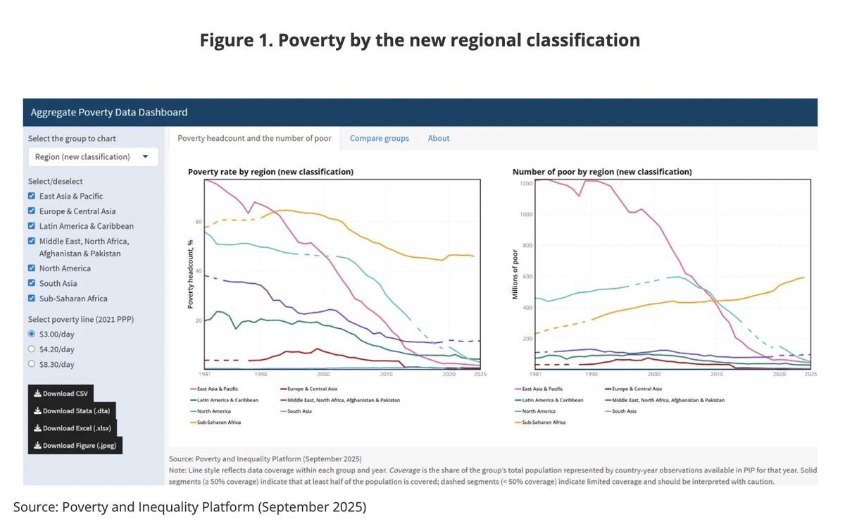
The @WorldBank’s Poverty and Inequality Platform (PIP) has recently been enhanced with new interactive features and improved accessibility.
Its Aggregates dashboard offers quick access to estimates and visualizations of #poverty by region, income group, fragility, conflict and violence (FCV) status, and lending group, making it easier to explore and compare poverty trends across countries and groups.
Read this @WorldBank blog by Jing Xie, Kayley Ashlyn Watson, @ChristophLakner, @zan_prinsloo, and @nishant_yonzan, which describes this essential resource for researchers, policymakers, and practitioners seeking to better understand global poverty dynamics: https://t.co/4aiFu7Oo1v
@JohnrMDPhD@momin_rayhan This seems to be caused by a sudden adverse shock to both research funding and government employment, decreasing supply of jobs for grads.
How does survey design impact poverty trends? Our new blog explores how changes in household surveys can create comparability breaks affecting global and regional poverty estimates. We propose adjustments using national accounts data to bridge these gaps
https://t.co/wYBd5dyl3h
@neocentrist Economics is a very broad field. A billionaire’s succes may (but in some cases, may not) indicate understanding in a very narrow sub-field.
New release of joyn R package. It is not just efficient, but also provides many useful diagnostic features for joining data frames in R. We use this frequently in the development work on the PIP data platform, and I hope you will find it useful too.
https://t.co/OUM33uYOaX
@charlesjkenny It doesn’t need to be the same. Many different poverty lines and indicators exist, and of course not all are comparable to each other. It just means that you should compare the comparable - i.e. poverty in 1990 and poverty in 2020 should be compared using consistent methodologies