So happy to be part of a GIS family. Thanks to @EsriUC and Jack for recognizing us at closing session. Hoping someday there will be a 4th generation GISer in the Cowen family. #GIS#EsriUC#family
@PetersonGIS In my first Cartography class we did individual assignments, but collaboration was so encouraged it felt like we were working in groups. Plus for the final project we did peer reviews for each (3) draft.
@jimmieangel Hey I love your HOWL map (https://t.co/A0yPJLyB4O) great job with the leaflet JS! I'm putting together a similar map for Cascadia Wildlands and was hoping we could get in contact
Anyone else think we'd see less inappropriately projected maps if @Esri and others incorporated the https://t.co/j5CLg71Wdo features into their coordinate system selector? Comment or upvote on #geoweb https://t.co/5S9DtAYPvJ
https://t.co/NOEx0otqo7
@John_M_Nelson loved your blog post about hacking story maps to add background color options. Got anything for hacking in layer control on a web map embedded in a story-map?
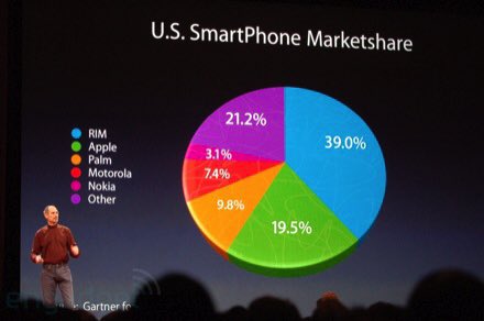
@JCullenNow This pie chart makes the green portion (19.5%) look bigger than the purple portion (21.5%). It may be a small difference and could be fixed if it weren’t angled, but displaying this with a bar chart is faster for our brains to process and can’t be skewed to a bias.
Data Vis talk takeaways:
-pie charts are bad
-doughnut charts are worse
-3D pie or doughnut charts are a punishable offense
#datavisualization#crime#EsriUC