Leaders of the Bastion Macropower Index 2024 Among Countries with GDP > $500 Billion
🇦🇪 United Arab Emirates
🇹🇼 Taiwan
🇸🇦 Saudi Arabia
🇮🇪 Ireland
🇨🇦 Canada
The rankings leaders have the best combination of economic growth, inflation, wealth, and state financial health👇
The country score represents the average of scores (1-10) across 5 indicators:
-Real GDP Growth
-Inflation
-GDP Per Capita PPP
-Population Growth
-Government Budget Deficit
Scores are assigned based on the country's performance relative to 190 countries for which statistics are available.
Based on IMF forecasts.
I've been seriously involved in markets for nearly 30 years and I've never before seen this environment where both fundamentals AND bearish technical indicators were so meaningless relative to what stocks are doing.
I've seen many bubbles, but the technicals CONFIRMED them!
Czy nieoczywista inwestycja zakończy się sukcesem? Zobaczymy. Przypływ środków z sprzedaży majątku trwałego (nieruchomości) postanowiłem przeznaczyć w akumulowanie #JPY Ponieważ nie trzymam pieniędzy w PLN tylko w walutach obcych, dlatego postanowiłem skupić się na przeznaczeniu nowych wpływów na zakup #JPY Transakcja na lokalach u dewelopera zakończyła się zwrotem +15% w ciągu 18 m-cy, ale teraz nie chcę kupować nieruchomości bo uważam, że będą lepsze okazje i to nie w PL. Jena kupuje i będę kupował fizycznie, bez lewara. Czas trwania inwestycji to koniec 2025 roku bądź +20% zysku.
There has been a lot of discussion lately about breadth divergences of various types, including Advance-Decline Lines, and so I figure that a primer is in order.
The very first analysts who ever looked at data on Advancing and Declining issues were Leonard Ayres and James Hughes, of the Cleveland Trust Company. Leonard Ayres was an interesting guy who had served as GEN Pershing's logistician in WWI, trying to figure out how to get horses, cannons, ammunition, and men across the Atlantic to fight in WWI, something that the U.S. Army had no experience with.
In 1926, after leaving the Army and becoming an investment manager, Ayres decided to undertake a study of what it might mean when the A-D data do something different than what prices do. That is why the extent of data we have on Advances and Declines go back to just 1926. I had heard a few years ago that the late Paul Desmond of Lowry's was going to undertake an effort to build the data going back further, using OCR reading of daily closing stock tables from microfiche copies of newspapers, but I never heard whether anything came of that effort.
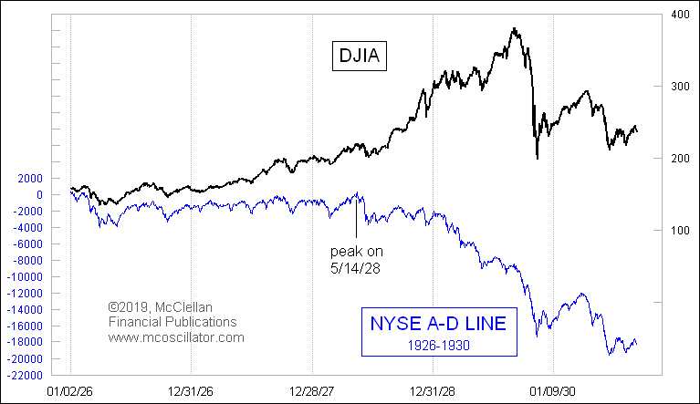
Here is what the A-D Line data looked like from those earliest years:
There was obviously a big fat bearish divergence at the price top in 1929, because most stocks were doing poorly by then and only the darlings were keeping the DJIA aloft. But nobody then knew then about this divergence, or if they did, they probably did not have any basis for interpreting its message. And besides, anyone who wasn't playing the stock market then on 10x leverage was a sucker who was missing out.
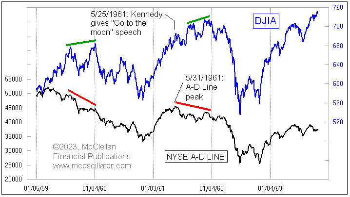
The early work of Ayres and Hughes was kept in obscurity for many years, and it was only in 1962 that the larger analytical world became aware of the utility of examining Advance-Decline data.
It was in 1962 that Richard Russell of The Dow Theory Letters, and Joe Granville of The Granville Market Letter, each separately pointed out how the NYSE’s A-D Line had shown a bearish divergence by topping in 1961, whereas the DJIA topped in early 1962. That divergence gave warning of the 27% decline in the DJIA in 1962. People got excited about an indicator which could give an early warning of a bear market like that, and so interest in the A-D Line grew during the 1960s.
For this reason, a lot of people got more interested in the 1960s about tracking A-D data, and that included my parents. They were followers of the late P.N. "Pete" Haurlan, and his Trade Levels Report. Haurlan was the first to introduce the use of exponential moving averages (EMAs) for tracking stock prices, a bit of math which had only been invented in the 1950s. You can read some more about that history here: https://t.co/4Y72HIVK9F. We prepared that 40-page document as a handout for attendees at the 2004 annual meeting of the Market Technicians Association, where my parents were honored with that organization's Lifetime Achievement Award. It include's Haurlan's booklet, "Measuring Trend Values", which discusses the calculation and interpretation of EMAs.
One of the criticisms of NYSE A-D data is that there are a lot of issues traded on the NYSE that are not "real" stocks. They currently amount to about 40% of the total number of issues. Things like SPACs, preferred stocks, warrants, and closed end bond funds are seen by many as contaminants to the data, and so some analysts will tell you that you should focus instead on the "common only" A-D data. I debunked that point here back in 2017: https://t.co/QofUN8hVFY
I spoke with Richard Russell about this a few years ago, before his death in 2015, and he acknowledged that shortly after both he and Granville brought the A-D Line into the public consciousness, critics claimed it was invalid because of its supposed contamination by the inclusion of utilities and insurance stocks, which were considered to be more influenced by interest rates rather than the “real” stock market. So this same dismissive argument has been around for years, but it has not diminished the usefulness of examining the A-D Line, when one does the analysis properly.
In the years since Ayres and Hughes first started tracking A-D stats, other breadth measures came along and became popular. Abe Cohen of ChartCraft (which later became Investors Intelligence) first created the Bullish Percentage Index back in the 1950s, measuring the percentage of NYSE stocks that were on a buy signal in point and figure charts. I cannot remember who first came up with looking at how many stocks out of a group are above their XXX-day moving averages. Measuring the stocks making New Highs and New Lows is another type of breadth study. All breadth indicators are "diffusion indices", meaning that they are measurements of the behavior of members of a group in some way.
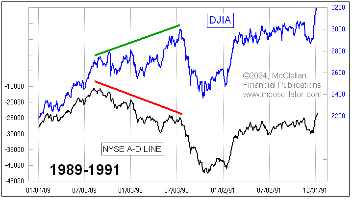
There are two main problems with breadth divergences affecting their use. The first one is that they will not tell you when they are going to matter, and it can sometimes take quite a while. The big divergence in 1989-90 lasted a year before Saddam Hussein helped it to matter when he invaded Kuwait.
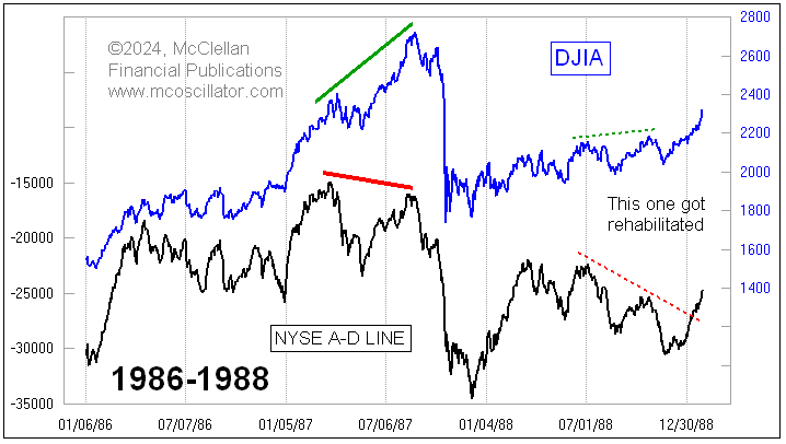
A second problem is that sometimes a bearish divergence can get "rehabilitated". A big, obvious A-D Line divergence in August 1987 mattered a whole lot. The divergence a year later in 1988 turned out not to matter, and the A-D Line redeemed itself in early 1989 by making a higher high.
This is why I like to remind people that a divergence is a "condition", and not a "signal". It is useful information, and it can shape how and if you respond to actual bearish "signals". Sometimes a bearish trading signal should be ignored under certain circumstances, especially if the market is in a strong uptrend. But such signals may deserve get extra consideration as being more likely to be valid when you have a bearish divergence informing you.
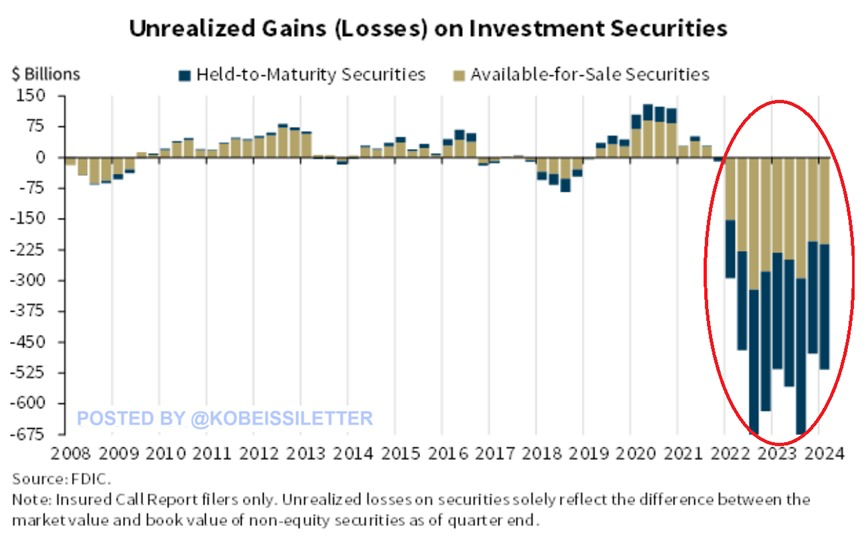
BREAKING: Unrealized losses on investment securities for banks jumped to $517 BILLION in Q1 2024.
This is $39 billion higher than the $478 billion recorded in Q4 2023.
The surge was driven by higher residential mortgage-backed securities losses held by banks due to rising mortgage rates.
Q1 2024 also marked the 10th consecutive quarter of unrealized losses, an even longer streak than during the 2008 Financial Crisis.
As “higher for longer” returns, unrealized losses are likely to continue rising.
Did the banking crisis ever really end?
#Nieruchomości
• ciekawe dysproporcje w dynamice wzrostu cen vs stawki najmu👇
„średnia rentowność najmu w sześciu największych miastach spadła w I kwartale bieżącego roku do zaledwie 3,6 proc.” - źródło BM Banku Pekao.📉
✂️ Nożyce się rozszerzają…
• dochody rosną szybciej od wydatków 📈
• powstaje nadwyżka (oszczędności)💰
—————————————————-
= dobry czas przed branżą zarządzania aktywami (#AssetManagement) ↗️
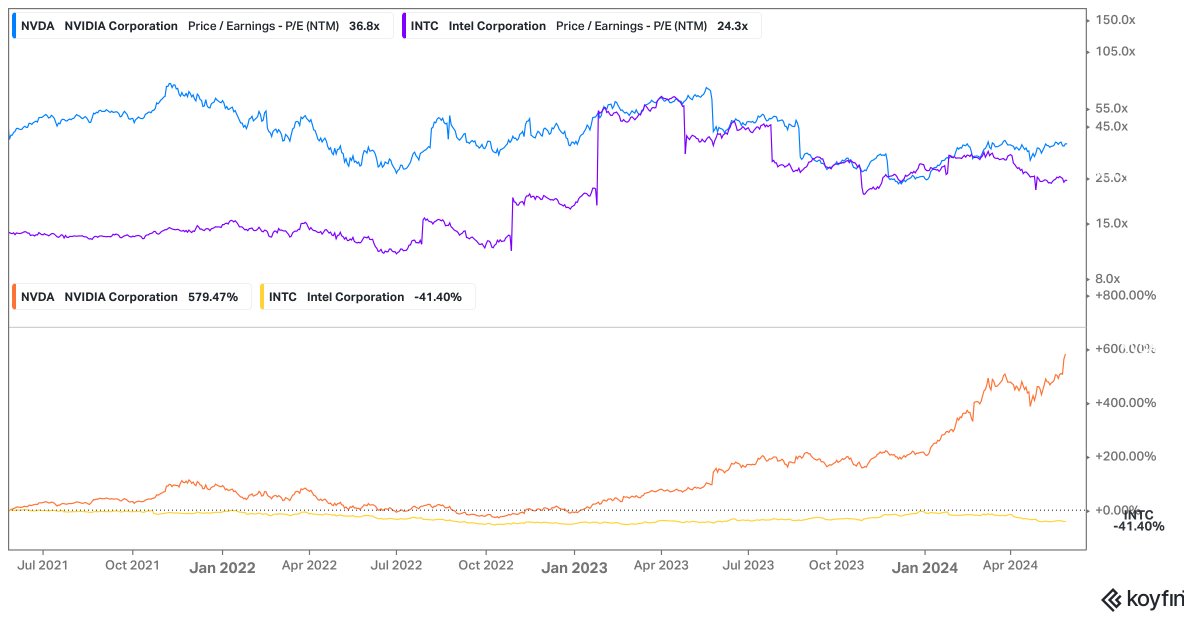
Three years ago, you could have invested in $INTC at just 13 times forward earnings or $NVDA at 39 times forward earnings.
The returns:
$NVDA +579%
$INTC -41%
To quote Terry Smith: "Owning good companies is more important than owning undervalued companies"
🇺🇸 Margin Debt
Margin debt continues to rise, remaining below extreme levels. This reflects the optimism among market participants and has the potential to drive further upward momentum in US stock prices
👉 https://t.co/blMxcoG7WG
h/t @Callum_Thomas#sp500#spx $spx #equities
#CPS#anomalia
👉Zaczynając analizować Cyfrowy nie sądziłem, że będzie to tak ciekawy przypadek.
Czyli mamy 14 mln PLN obrotu w 1h,
na -3% w poniedziałek bez newsflow.
Wróciła zdeterminowana podaż.
Pisałem tu o dominujących kurs
hedge fundach, więc niby nie powinno to dziwić, ale…
..doszła do dzisiejszej nagłej, znowu nienaturalnej, uderzającej po poziomach podaży, zastanawiająca anomalia.
👇W weekend z pierwszej strony WP zaatakował mnie headline o „rekordowym zadłużeniu Polsatu” z przekierowaniem do artykułu Money.
Artykuł tak absurdalny, bez treści, bez kontekstu, obliczony na efekt wystraszenia, z nieadekwatnie ogromnym zasięgiem, że odrazu zapala się czerwona lampka. Kto i po co?
Pójście dalej tym tokiem myślenia, nie prowadzi wg mnie, tym razem do hedge fundów…
Ale dziś to tak zostawię i wyjątkowo nie pociągnę tego toku myślenia dalej…
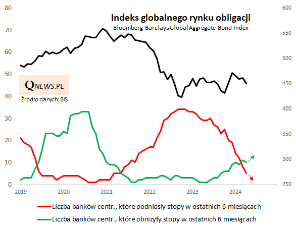
Wraz z pierwszą w tym cyklu obniżką stóp w Szwecji globalna fala cięć stóp nabiera tempa, a fala podwyżek wygasa. To powinno pomagać poturbowanemu globalnemu rynkowi obligacji. -> https://t.co/NnHtyRdpg7
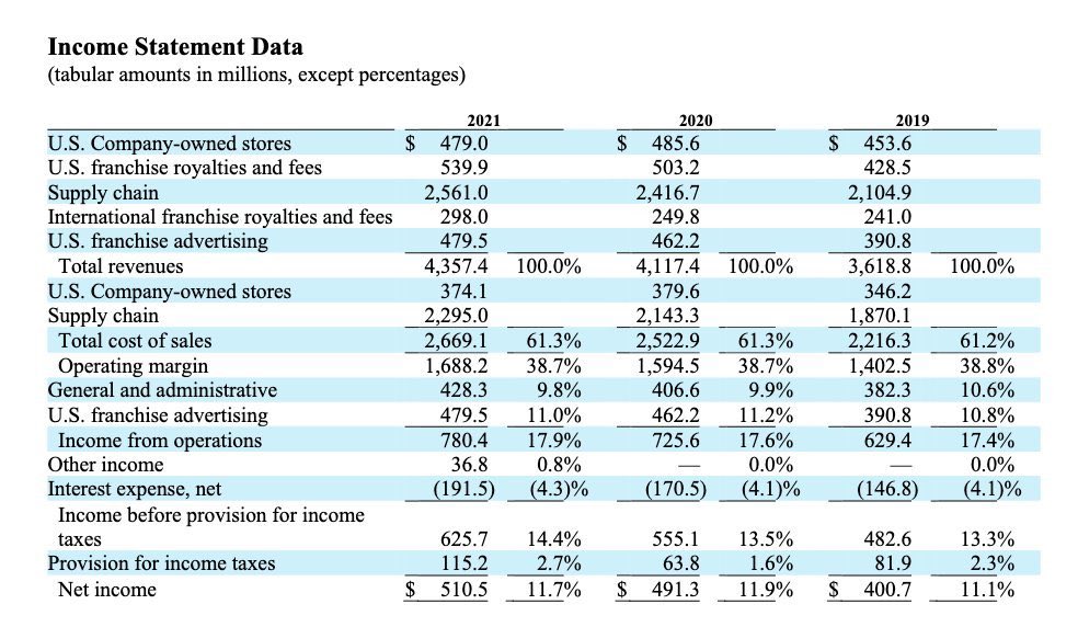
🚀Do you know how to read an income statement ?
Being able to read an income statement is CRUCIAL to make good investment decisions.
I'll teach you how to analyze an income statement in 5 minutes: