My data viz work for https://t.co/xyh2LC3qx0: "Pediatric Suicide-Related Hospital Encounters for 13- to 15-Year-Olds Up 60% Since 2017". More data for people like @JonHaidt#dataviz
Understanding more about the excess mortality during the pandemic in California
https://t.co/9Wem7WjytS @JAMAInternalMed
"We hypothesize ... faced by low-wage, essential workers .. owing to occupational exposure, crowded housing, and inadequate access to testing or treatments."
Love this "lightning-fast" graph for context of 140 years in vaccine development; superimposed colored dots
https://t.co/akBebQZ1PZ
@NatureNews @philipcball @OurWorldInData
Really enjoyed this UI design Tour de Force by @borism and @frankrausch: Menus, Metaphors and Materials: Milestones of User Interface Design https://t.co/BovbZxB6oq
Georgia peaks this week: the dotted green line is the projected beds needed, the solid green line is ICU beds available, and the light green is the range of uncertainty. My heartfelt support to all the good people working to flatten that curve.
https://t.co/5gpqof0NAm
New Blog Post – when visualizing data over time, the current PARTIAL month is a challenge because it often looks like sales are tanking! This blog post, written with @EthanHahnEH, provides numerous ways for you to visualize the current, partial month. https://t.co/ckvyzQKWov
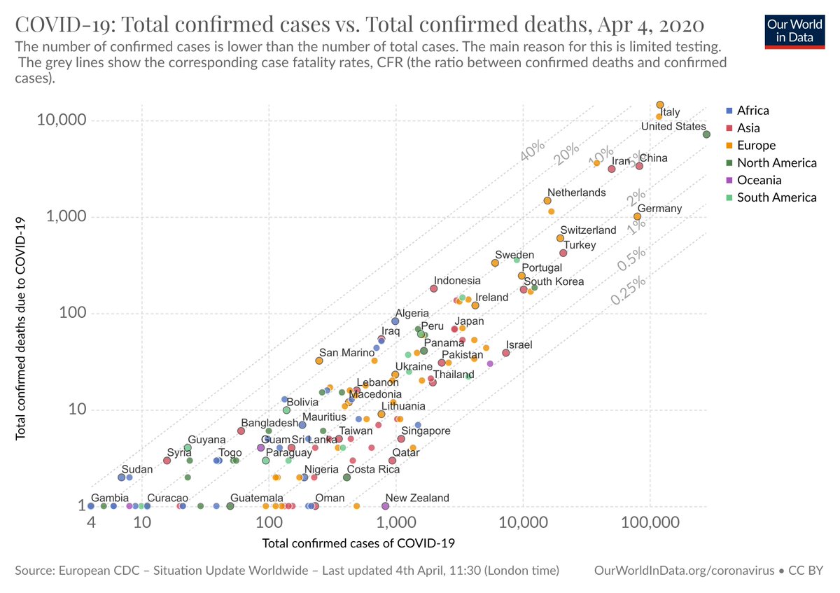
Our attempt to show in a transparent way how the case fatality rate (CFR) is determined.
We plot confirmed cases against confirmed deaths – and you can then read the CFR as the ratio between these two measures.
Here is how to interpret it
https://t.co/qu4kwn8dtz