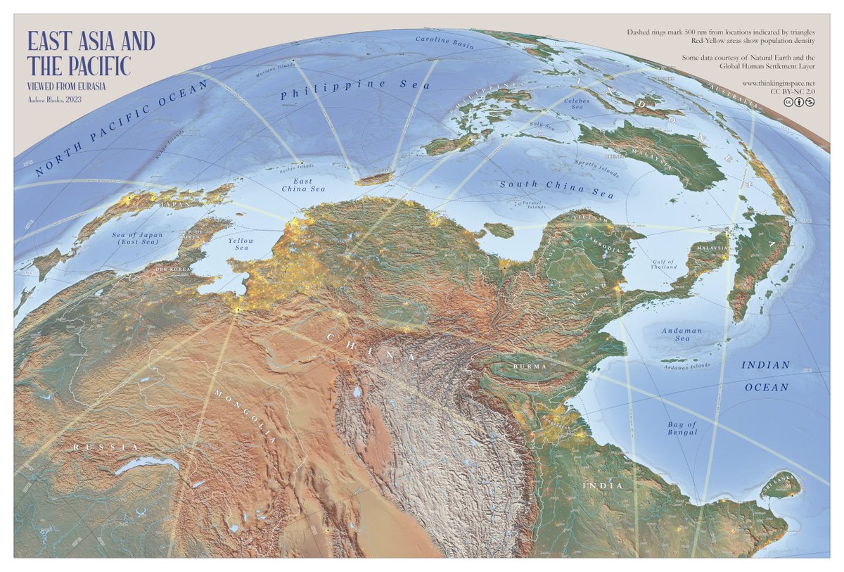
My new wall map "East Asia and the Pacific: Viewed from Eurasia" is now available for free (CC BY-NC 2.0) as a high-resolution download. Prints well at 20"x30" or larger. Thanks to everyone who provided helpful comments during many revisions.
https://t.co/rYjmtXxSPw
This beautiful map was created by Charles Joseph Minard a round 1860s. He is one of the fathers of modern infographics. Here he visualises the vast German migration streams heading to the US via Hamburg and Bremen. Looking at it, it's no surprise that so many North Americans trace their roots back to German-speaking Europe. Australia received Brits in large numbers.
Working on another simple web-based mapping tool to make it possible for anyone to make a map like this in 30 seconds. Also adding GeoJSON export function to my tools for those who want a simple sketch tool they can import to GIS.
A threeJS tour of great moments in U.S. chemical processing history for Kunin (@drauwsy), a TN chem-eng startup making ion-exchange filters that’ll recover all the scandium we need
Relief with @EduardShading , geologic sections shaded in, covers Hanford, Oak Ridge, all the hits
18x14" pictorial map of the U.S. by Miguel de Covarrubias for the Jan. 1943 issue of Esquire; that outline key on the back...
"Something of the flavor and scope of this America, something of its large tolerance of differences are here conveyed by Miguel de Covarrubias."
Extending my #QGIS color sampling tools series, I’m currently developing a tool that converts RGB values sampled from scanned maps into a #GPL file, allowing them to be easily imported as a color palette directly into the #Colors panel. I’ll make it available online soon!
Apropos of nothing I asked AI to create a map of 100 Aker Wood as if that community had suffered a significant outbreak of cholera. The result is bordering on brilliant, and clearly establishes the cause of the outbreak as Pooh in the water source near Piglet's house.
This is the hydrographic system of the Río de la Plata Basin. We see the primary river system feeding the famous Río de la Plata. The whole basin spans five South American countries: Argentina, Bolivia, Brazil, Paraguay, and Uruguay. A visually very pleasing piece by @maroni_editor.
➡️ La carte du jour : Le dispositif militaire de l’Otan en Europe
Depuis 2014, l’Otan renforce son flanc oriental, de l’Arctique à la mer Noire, en réponse à la guerre en Ukraine et aux tensions avec la Russie.
The Hao Xiaoguang’s Generalized Latitudinally Equal-Differential Polyconic Projection has been successfully migrated to QGIS for both vector and raster data. By adjusting different rotation parameters, maps can be arranged in four orientations.
➋ Don’t want to make your own maps? Just pay my exorbitant rate, I’ve made maps for National Geographic, a big oil refiner, an Ojai trail system, an El Segundo core-drilling startup (engineers apply to @DurinMining right now):
https://t.co/YkJx6SNleL
https://t.co/32GjLdKHCU
Need a different style? Hire one of these other great mapmakers:
@verygoodmaps@JapanMapping@RhodesMaps@FleischerHannes
https://t.co/ciFVcQWfSS
https://t.co/Pipo78a86W
https://t.co/W9dVgvxMM9
https://t.co/ca6KZxgYJI
https://t.co/sXFm1mKwD6
https://t.co/YU2IZo2j2M
https://t.co/JAiRWc6z5j
https://t.co/vFnqy40Exh
https://t.co/yXRQ4rbr1J
https://t.co/XJqQRJvTZA
https://t.co/UlW1FDFiFd
https://t.co/vX3SAnrsUb
https://t.co/wXi4Znwh8Y
https://t.co/cVjKa6XGDU
https://t.co/kB6HGkT92e
https://t.co/OsqUEJlUUZ
https://t.co/X9Zbs1iG2V
https://t.co/odJILFYqzV
https://t.co/9bu7nYkhlf
https://t.co/jS2FmJ34NZ
Très heureuse de faire "la une" de la revue @Grand_Continent aujourd'hui avec cette cartographie de l'espace stratégique chinois. L'occasion de retrouver les cartes créées par @CIGeography pour mon étude pour le NBR publiée fin 2024.


![RhodesMaps's tweet photo. OTD in 1945...
[May 17, 1945], HQ Twelfth Army Group situation map
https://t.co/VaFqXOlKMb
@LOCMaps https://t.co/1Th11Hh6p2](https://pbs.twimg.com/media/HIisi9pW4AARfFg.jpg)


![RhodesMaps's tweet photo. OTD in 1945...
[May 17, 1945], HQ Twelfth Army Group situation map
https://t.co/VaFqXOlKMb
@LOCMaps https://t.co/1Th11Hh6p2](https://pbs.twimg.com/media/HIisi9_XYAAjtcV.jpg)


