The US job market is showing further signs of weakness:
Only 9% of small business owners said in May that they plan to hire over the next 3 months, the lowest since May 2020.
Excluding the 2020 pandemic, this is the lowest reading in 10 years.
Small business hiring plans have trended lower over the last 6 months.
Historically, this has been a leading indicator for nonfarm private payrolls by roughly 4 months.
This comes as small firms account for ~46% of all US private sector employment and suggests that private payroll growth could turn negative as early as Q3.
Hiring demand among small firms is weakening.
Nasdaq vs Berkshire
La última vez que el Nasdaq 100 estuvo tan desacoplado de la acción que mejor representa la inversión en valor, no vino algo bueno.
Pero la historia siempre puede ser diferente.
Margin debt as a % of GDP just hit an all-time high.
4.0%. Higher than August 2021. Higher than March 2000. Higher than July 2007.
Every previous peak on this chart preceded a major drawdown:
– June 1968: end of the Nifty Fifty bull
– Aug 1987: Black Monday
– March 2000: dotcom crash
– July 2007: GFC
– Aug 2021: the 2022 bear market
The chart doesn't predict the future. It predicts who can't sit through it.
Leverage doesn't kill you when you're right.
It kills you when you have to sell at the wrong time.
All Fear is gone
Goldman Sachs panic index closed Friday at a 1 handle (2y lows): It includes 2y pct rank of VVIX, VIX, skew, & ATM vol. It will open even lower this morning.
Prepare for June to throw market participants volatility to shake things up.
Have a lovely Monday😊
Esto no es para asustar. Es para no llegar tarde.
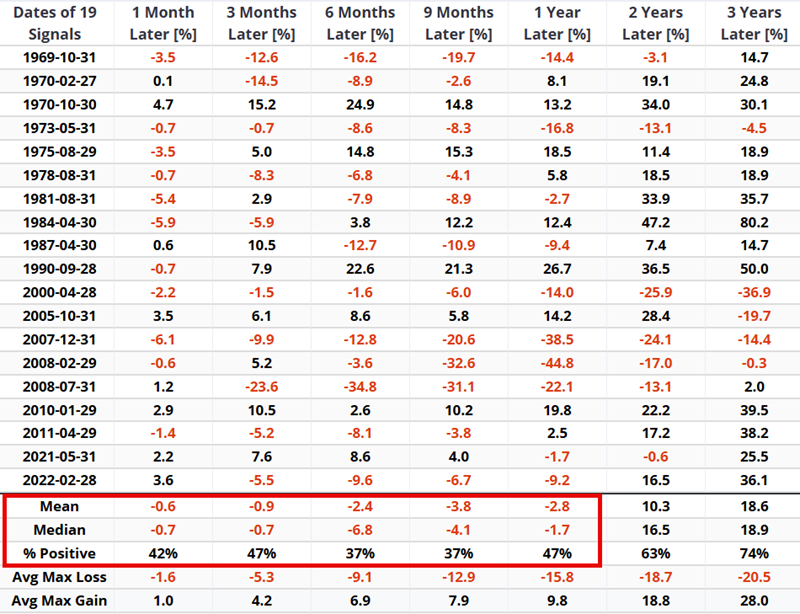
Cada vez que el Índice de Miseria JK superó 35 desde 1969, el SP500 mostró debilidad clara después.
Y el dato que no conviene ignorar: Retorno mediano a 6 meses del -6,8%.
¿Luego recupera desde ese punto? Sí. Por tanto, podría ser una pista de dónde pueden estar las zonas de venta táctica y de recarga fuerte (dentro de la tendencia estructural alcista).
(Gráfico @sentimentrader)
The P/E10 ratio* closely tracks the real (inflation-adjusted) price of the S&P Composite, with a detrended correlation of 0.9977 since 1881.
*NOTE: The P/E10 ratio, also known as the CAPE Ratio, is a stock valuation metric that divides a broad market index's current price by its average inflation-adjusted earnings over the past 10 years. It has been used by analysts to determine how expensive or cheap the market is. It strips out noise and looks at real earnings adjusted for inflation to give investors a better sense of value.
The historical average for the P/E10 is 17.7, but it has experienced dramatic swings between over- and undervalued periods.
The latest April reading of 37.9 is 69% above its long-term trendline. The disconnect has grown even wider as we closed out May.
Prior overshoots include:
• Panic of 1873 (Railroad bubble)
• Panic of 1907 (Copper Scheme)
• 1929 (Peak before Great Depression)
• 1966 (Peak before stagflation of the 1970s)
• 2000 (Peak of dot-com bubble)
• 2007 (Peak prior to GFC)
• 2021 (Last peak before 2022 Bear)
However, none of the prior overshoots I just listed, as shown in the attached chart, extended as far above the market’s “fair valuation” trend as today.
‼️2026 is by far the largest disconnect from trend in over 150 years‼️
And regardless of how big this current bubble is blown, this time is NOT different. All prior overshoots were followed by a drastic decline in markets, both in real and nominal terms.
Have a lovely Sunday. 😊
Source: Advisor Perspectives
Here is an actionable idea: shift capital from energy to healthcare. Rarely in the last few decades has the energy sector had a valuation that is this high relative to the hated healthcare sector. Twenty+ year chart here, so be mindful of time horizons.
19 JK Misery Index sell signals since 1969.
When JMI moved above 35, the S&P 500 averaged negative returns from 1 month through 1 year later. Median 6-month return: -6.8%.
Históricamente, mantener inversiones por más tiempo aumentó muchísimo las chances de retornos positivos:
1 año: 67%
3 años: 88%
5 años: 93%
10 años: 100%
⚠️ El indicador compuesto de valoración del S&P 500 está en zona de burbuja. Igual que en 1999. Igual que en 2021.
📊 Las tres veces que el indicador tocó zona extrema (+1):
🔴 1999-2000: burbuja puntocom. Caída posterior: -49%
🔴 2021: rally post-pandemia.
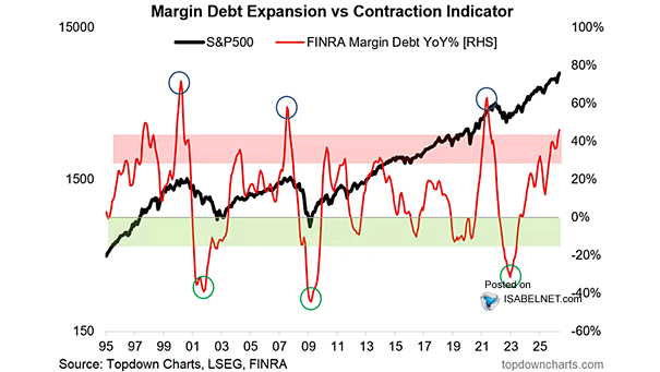
Margin debt is surging into territory that has some investors on edge, firmly in what many would call the danger zone. For now, however, margin debt expansion supports the momentum upside, but any reversal will also fuel the sell-off. It's a double-edged sword that cuts the deepest on the downside.
h.t @ISABELNET_SA
Two S-TCTM members just flipped to risk-off.
The NYSE High-Low Ratio and Cyclical Groups Divergence Model triggered while $SPX hugs 252-day highs.
Signal count: 40% of components now warning.
Surface calm. Internal tension.
Read full analysis: https://t.co/iJUI9CK6Aq
Mortgage rates. Inflation. Unemployment.
Combined into one number, the JK Misery Index has been a surprisingly reliable trading signal.
Above 35: S&P 500 win rate 47% over the next year.
Below 35: 77%.
Current reading: 30.37.
Trending up.
Read full analysis: https://t.co/MCP3jEQoYB