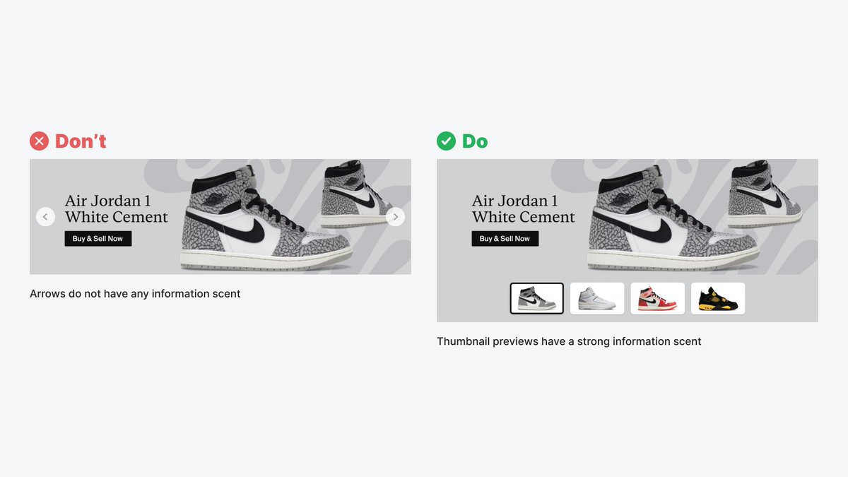
Studies show homepage banner carousels don't get much user engagement. But it's not because carousels are bad, but because the arrows don't carry information scent.
Thumbnail previews have a strong information scent and are better interaction cues to use.
C'è poco da dire: @divagatrice e @emenietti sono proprio bravi.
Nell'ultima puntata del loro podcast "Ci vuole una scienza" c'è, tra i vari interessanti argomenti, una chiarissima spiagazione del "false balance", o falsa equivalenza.
https://t.co/sKFMH7h9wn
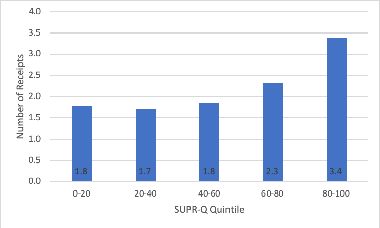
Participants who had the best experience (top SUPR-Q percentile) on a website uploaded almost double the number of receipts as those who had the worst experience. https://t.co/OK0gjNOcDn
What to look for, what to configure, and what to build, so a faulty cookie banner interface won’t put you in violation of accessibility laws or, more importantly, exclude users from accessing your content and exercising their rights.
Organizing content is a difficult task, especially when we don't know what content we'll be producing in the future. @brownorama writes on why some organization schemes want categories that cut across the normal taxonomy.
https://t.co/SCZGvtC1a3
UX researchers are human—and no human is immune to unconscious bias. Here’s how to minimize bias for better (more ethical) outcomes. https://t.co/xkSvxzOm0s