For this week #TidyTuesday , we got lucky: Pokémon data with URLs for their icons. I couldn’t resist adding a few little Pokémon to the plot while doing a simple outlier analysis.
Code: https://t.co/bV9xrl9KpB
ChatGPT é apenas uma mancha no enorme universo da IA.
Estudei 100s de lançamentos de novas ferramentas de IA ao longo dos últimos 3 meses.
Aqui estão 8 novos websites de IA de última geração que farão o seu trabalho por si.
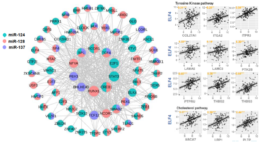
So glad to see our collaboration (@DerGuardia@pafgalante) with @LOFPenalva published in Neuro-Oncology.
ELF4 is a critical component of a miRNA-transcription factor network and is a bridge regulator of glioblastoma receptor signaling and lipid dynamics https://t.co/CmaIgBzwTA
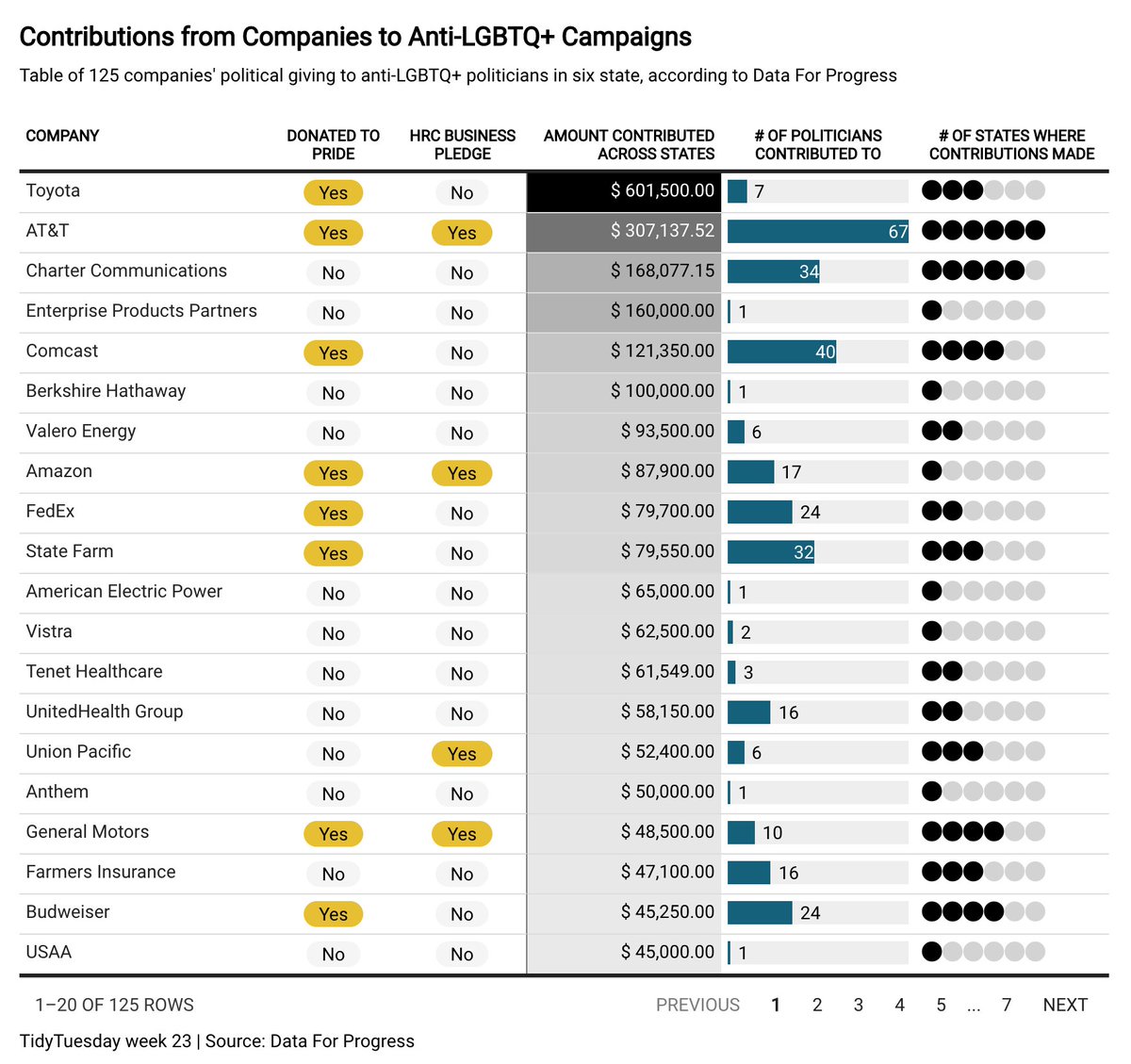
I'm so very excited to announce the first CRAN release of {gtExtras}!
Read a summary of the package at: https://t.co/QboCWpaz7o
Download from CRAN:
install.packages("gtExtras")
#RStats#dataviz
I'm thrilled to share our MuSiCal (Mutational Signature Calculator) manuscript: https://t.co/CHYm2lYUhI Mutational signature analysis, pioneered by colleagues at Sanger, has become a key tool for interpreting somatic mutations identified in sequencing data. 3 main concepts (1/8):
It's an honor to see our manuscript on the cover of @JPathology (Vol 256 Issue 2). Congrats @_rbarreiro, Paula Asprino and colleagues:
https://t.co/xpP2o1MZYq
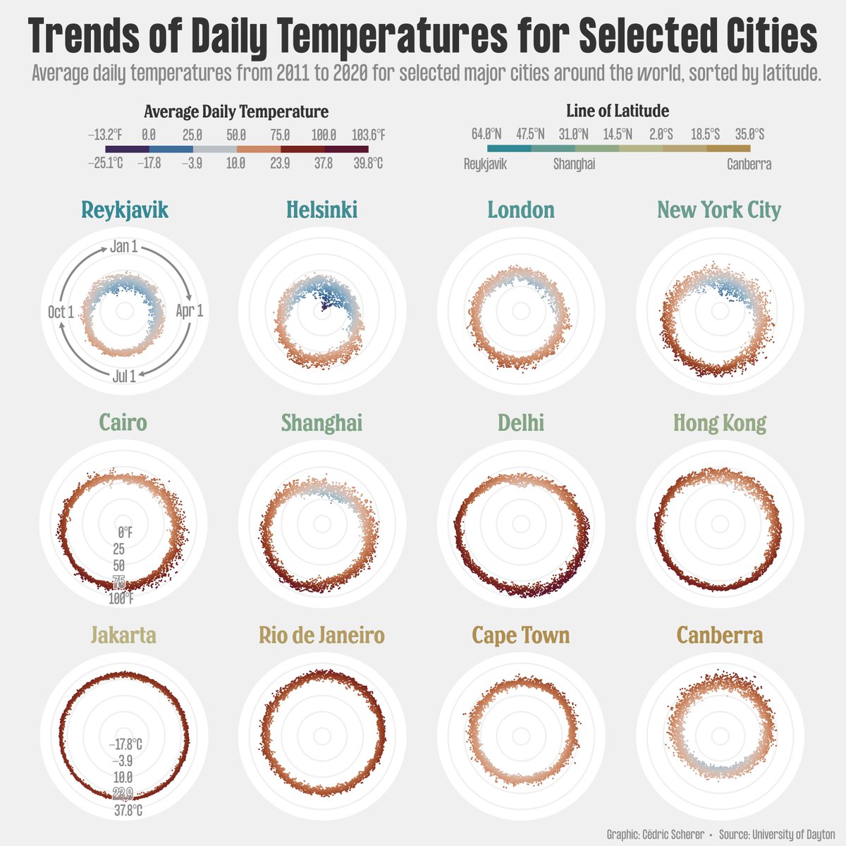
#30DayChartChallenge | #Day11 | #Circular
Circular #dataviz showing average daily temperatures around the year for selected cities of the world, sorted by latitude (plus an alternative version sorted by overall average in the 🧵).
Made with #rstats + #ggplot2 and #Figma.
Five quick #rstats tips I've picked up in the plots I've made for the first category of the #30DayChartChallenge 🧵👇
1. Need to plot a million points and ggplot() is taking too long but you want to stay within the tidyverse?
👉 Use 📦{scattermore} with geom_scattermore() 🥳
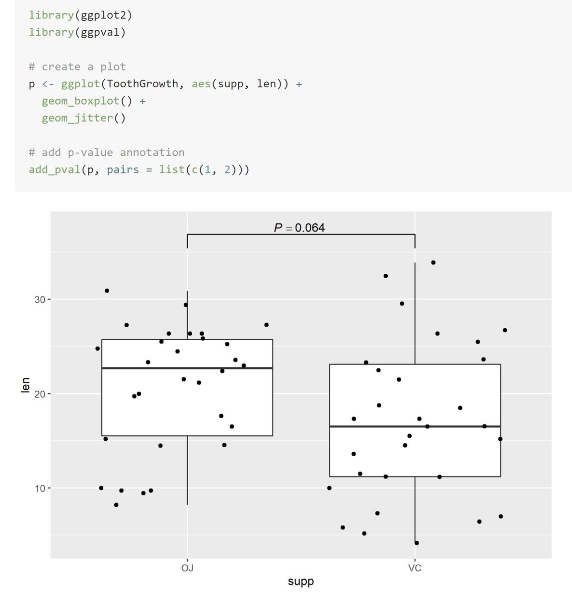
When we are interested in studying group differences, sometimes we may wish to annotate our visualizations with results from significance testing.
The {add_pval} from {ggpval} 📦provides a way to do this! ⚖️
https://t.co/X1pKEeFHnG
#rstats#DataScience
Circosplot and retrocopies were meant for each other! I'm happy to bring this new poster about retrocopies a facinating genomic elements. I hope you find it incredible as I do! Plots were made in R {gglplot} and {circlize} and refined in Affinity Designer #genomics#dataviz#r4ds
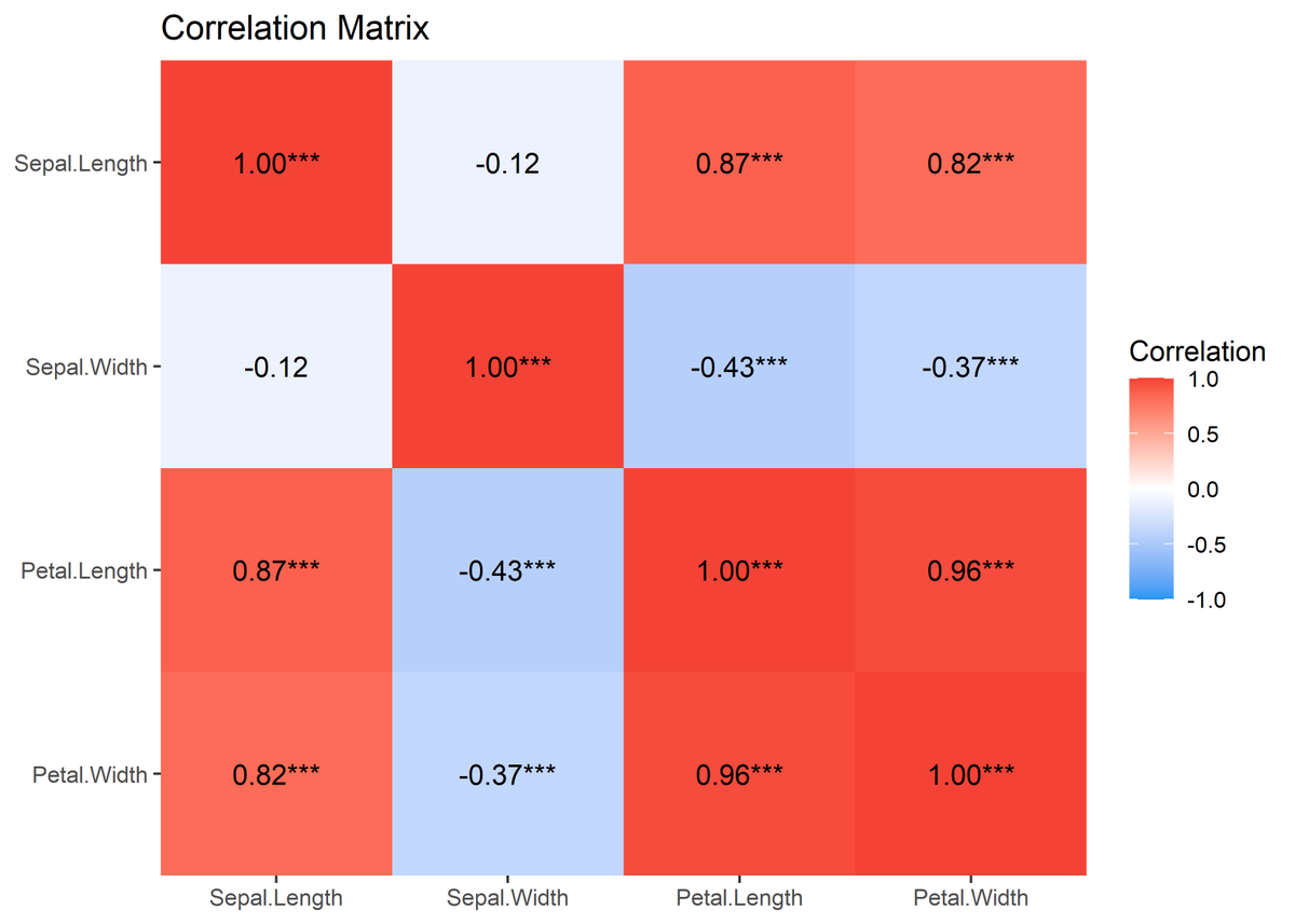
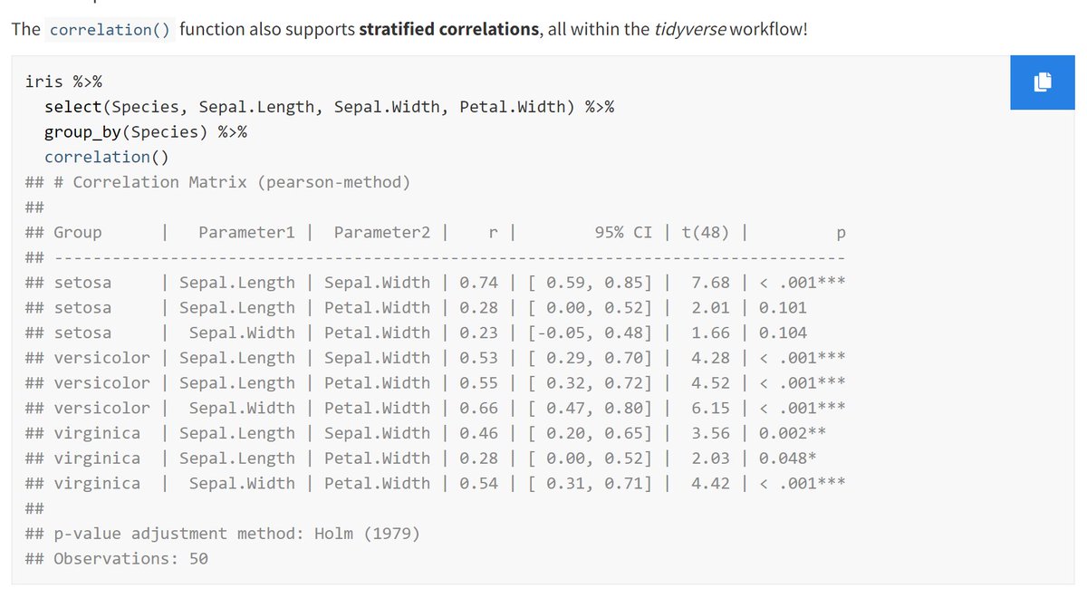
ICYMI, the `correlation` is an absolute beast of a function! 💪
https://t.co/49F03jgiym
It:
✅ runs 16 kinds of correlations
✅ supports their Bayesian and partial variants
✅ handles grouped dataframes
✅ has pretty plotting methods
✅ returns matrices or dataframes
#rstats
For this #TidyTuesday, I looked at the difference between the estimated weight and the real weight of giant pumpkins for the Great Pumpkins Commonwealth.
Code : https://t.co/Pqie3OtgA3
#rstats#dataviz#r4ds#ggplot2
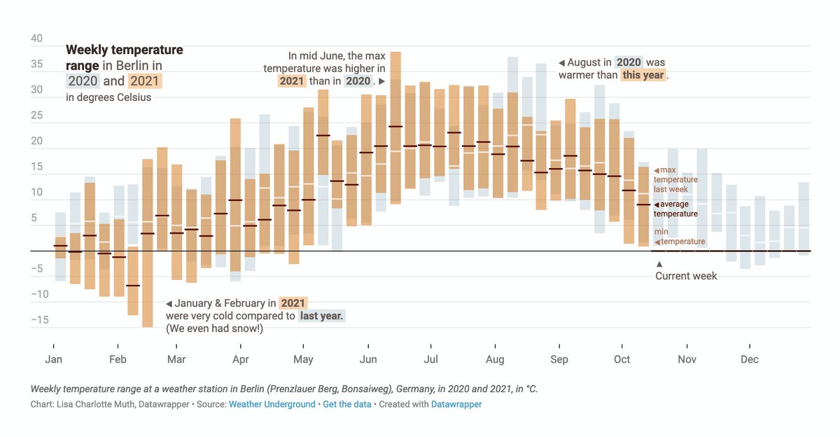
For this week's Weekly Chart, I built a little #dataviz to show weekly temperature ranges in Berlin. That was fun! Find the full how-to (incl. video) here: https://t.co/ODWVW1s1sy