Shewchuk, please answer these question about your graphic:
If your goal is scientific accuracy, why does your graphic consistently choose metrics, baselines, and visual framing known to downplay or obscure well-established climate trends?
On hurricanes (top-left panel):
-Why did you plot total global hurricane counts rather than intensity (Category 3–5), which is the metric climate science expects to change with warming?
-How do you account for improved satellite detection since the 1970s, which artificially inflates earlier undercounts?
-Why does your graph exclude Accumulated Cyclone Energy (ACE), a standard metric used by NOAA and the IPCC?
-Can you explain why you used a simple linear trendline on highly variable data without showing uncertainty or statistical significance?
-Are you aware that the IPCC reports low confidence in long-term trends in total cyclone counts but higher confidence in increasing intensity and rainfall? Why is that omitted?
On tornadoes (top-right panel):
-Why did you use EF2+ tornado counts starting in 1950, when reporting practices and radar technology changed dramatically (especially post-1990 Doppler radar)?
-How do you correct for non-climatic inhomogeneities in the tornado record that NOAA explicitly warns about?
-Why not show normalized or environment-based metrics (e.g., convective available potential energy, shear trends) instead of raw counts?
-Can you point to any major scientific body that uses this dataset to claim tornado risk is decreasing?
On wildfires (bottom-left panel):
-Why are you presenting global burned area without clarifying that the decline is largely due to agricultural expansion and land management, not climate effects?
-Why omit data showing that fire weather conditions (heat, drought, vapor pressure deficit) have increased significantly?
-Why not show regional trends, such as the well-documented increase in extreme fires in places like western North America or Australia?
-Do you agree that burned area ≠ fire severity or ecological impact? If so, why present it as evidence of “less extreme weather”?
On disaster deaths (bottom-right panel):
-Why are you using raw death totals rather than deaths per capita, given global population growth?
-Why omit the role of improved infrastructure, forecasting, and disaster response, which are the primary drivers of reduced mortality?
-Are you suggesting that fewer deaths means hazards are decreasing, or just that humans are better at surviving them?
-Why include 2020–2021 as partial data points, which visually exaggerate the decline?
On CO₂ comparison (across panels):
-What is the scientific justification for visually comparing CO₂ (a smooth upward curve) with highly variable hazard data without any causal analysis?
-Why do you imply a relationship using dual-axis graphs, a technique widely criticized for creating misleading visual correlations?
-Can you provide a peer-reviewed attribution study showing that rising CO₂ should reduce these hazards?
On selective omission:
Why does your meme omit:
-Heatwaves (one of the most robustly increasing extremes)?
-Extreme rainfall and flooding intensity?
-Marine heatwaves?
-How did you decide which indicators to include versus exclude?
On methodology and transparency
Can you provide:
-The full datasets used (not just sources)?
-The code or method used to generate the graphs?
-Any uncertainty ranges or statistical tests?
-Why are these figures presented without error bars, confidence intervals, or methodological caveats?
@_ClimateCraze John, you've had two months now to answer questions about your fake graph. Surely, you must have thought of an answer.
https://t.co/DMdimj35MT
Shewchuk -some questions for you:
1. Why are you averaging raw absolute maximum temperatures instead of anomalies (each station’s deviation from its own long-term baseline)?
Every climate dataset on Earth uses anomalies precisely because raw absolute temperatures are dominated by fixed geography - things like elevation, latitude, and local terrain that never change.
Your “dumb average” is scientifically worthless for trends.
2. As a retired meteorologist and former NWS COOP observer, why do you completely ignore the Time of Observation Bias (TOB)?
The documented shift from afternoon to morning readings cooled the raw record by ~0.3 C.
That alone explains most of your flat “raw” line.
3. Why does your “raw” chart never match the official unadjusted USHCN TMAX data when properly processed as anomalies?
4. If NOAA’s adjustments are “fraud,” why does the pristine, bias-free USCRN network (installed since 2004 with no TOB or siting issues) match the adjusted USHCN trends and anomalies almost perfectly, but diverge from your raw data?
5. Your chart only shows US maximum absolute temps.
Why does your “raw” claim disappear when you look at minimum temperatures, global datasets, satellites, reanalyses, or ocean heat content, all of which show clear warming?
6. Can you post your exact code and the specific USHCN version/date you used so independent analysts can reproduce your “raw” flat line?
Shewchuk, please answer these question about your graphic:
If your goal is scientific accuracy, why does your graphic consistently choose metrics, baselines, and visual framing known to downplay or obscure well-established climate trends?
On hurricanes (top-left panel):
-Why did you plot total global hurricane counts rather than intensity (Category 3–5), which is the metric climate science expects to change with warming?
-How do you account for improved satellite detection since the 1970s, which artificially inflates earlier undercounts?
-Why does your graph exclude Accumulated Cyclone Energy (ACE), a standard metric used by NOAA and the IPCC?
-Can you explain why you used a simple linear trendline on highly variable data without showing uncertainty or statistical significance?
-Are you aware that the IPCC reports low confidence in long-term trends in total cyclone counts but higher confidence in increasing intensity and rainfall? Why is that omitted?
On tornadoes (top-right panel):
-Why did you use EF2+ tornado counts starting in 1950, when reporting practices and radar technology changed dramatically (especially post-1990 Doppler radar)?
-How do you correct for non-climatic inhomogeneities in the tornado record that NOAA explicitly warns about?
-Why not show normalized or environment-based metrics (e.g., convective available potential energy, shear trends) instead of raw counts?
-Can you point to any major scientific body that uses this dataset to claim tornado risk is decreasing?
On wildfires (bottom-left panel):
-Why are you presenting global burned area without clarifying that the decline is largely due to agricultural expansion and land management, not climate effects?
-Why omit data showing that fire weather conditions (heat, drought, vapor pressure deficit) have increased significantly?
-Why not show regional trends, such as the well-documented increase in extreme fires in places like western North America or Australia?
-Do you agree that burned area ≠ fire severity or ecological impact? If so, why present it as evidence of “less extreme weather”?
On disaster deaths (bottom-right panel):
-Why are you using raw death totals rather than deaths per capita, given global population growth?
-Why omit the role of improved infrastructure, forecasting, and disaster response, which are the primary drivers of reduced mortality?
-Are you suggesting that fewer deaths means hazards are decreasing, or just that humans are better at surviving them?
-Why include 2020–2021 as partial data points, which visually exaggerate the decline?
On CO₂ comparison (across panels):
-What is the scientific justification for visually comparing CO₂ (a smooth upward curve) with highly variable hazard data without any causal analysis?
-Why do you imply a relationship using dual-axis graphs, a technique widely criticized for creating misleading visual correlations?
-Can you provide a peer-reviewed attribution study showing that rising CO₂ should reduce these hazards?
On selective omission:
Why does your meme omit:
-Heatwaves (one of the most robustly increasing extremes)?
-Extreme rainfall and flooding intensity?
-Marine heatwaves?
-How did you decide which indicators to include versus exclude?
On methodology and transparency
Can you provide:
-The full datasets used (not just sources)?
-The code or method used to generate the graphs?
-Any uncertainty ranges or statistical tests?
-Why are these figures presented without error bars, confidence intervals, or methodological caveats?
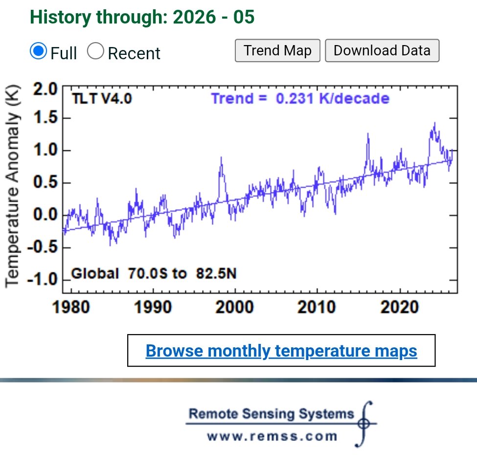
Satellite data from RSS. A global warming rate of 0.231°C/decade! There are many signs the rate is increasing, which follows from the fact that humans continue to add CO2 to the atmosphere at a rate faster than natural processes can remove them.
https://t.co/fWNOBvdETO
@_ClimateCraze@MatCMeier This is what the satellite data shows from RSS. What do you think is causing the temperature rise of 0.231 °C/decade?
The rate is also increasing.
@_ClimateCraze I think it's because the UN looks at the world as a whole, and are not out to cherry-pick 2% of the land area like you, John. For the whole world it looks like this.
@_ClimateCraze@barlow2021@CScharun Sometimes you can discern dips in the global temperature (like the one 3500 years ago). But the last spike is unprecedented, because of man-made CO2.