⚠️ATENCIÓN⚠️
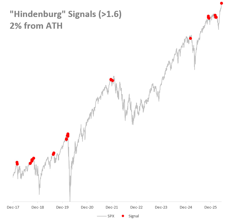
EL "HINDENBURG OMEN" SE ACTIVÓ AYER EN EL SP500 POR PRIMERA VEZ DESDE FEBRERO DE 2026.
💥El indicador más dramáticamente nombrado de Wall Street acaba de encender su señal de alarma.
¿Qué es el Hindenburg Omen y por qué se llama así?
👉Creado por el analista Jim Miekka en los años 80, lleva el nombre del famoso zeppelin alemán que se incendió en 1937.
🎯 Las tres condiciones que activan la señal:
🔻El SP500 en tendencia alcista (por encima de su media de 50 días)
🔻Tanto los nuevos máximos como los nuevos mínimos de 52 semanas superan el 2,2% del total de acciones
🔻El McClellan Oscillator (indicador de amplitud del mercado) está en negativo
🔻Cuando las tres coinciden, el mercado está enviando una señal contradictoria: el índice sube pero por dentro hay acciones quebrando mínimos al mismo tiempo que otras rompen máximos.
🧨Lo que dice el historial concreto de retornos:
📍El SP500 termina en NEGATIVO solo el 70% del tiempo al mes siguiente, con una pérdida promedio de -4,09%.
📍La señal resulta especialmente preocupante cuando se activa simultáneamente en el NYSE y el Nasdaq, porque ese setup es raro durante un rally fuerte y sugiere que el deterioro interno es más amplio de lo normal.
📍El gráfico es bastante claro: desde 2017, esta señal solamente apareció CERCA DE TECHOS IMPORTANTES del SP500...
𝗕𝗧𝗖 𝗥𝗲𝗽𝗲𝘁𝗶𝘁𝗶𝗼𝗻 𝗙𝗿𝗮𝗰𝘁𝗮𝗹 𝗖𝘆𝗰𝗹𝗲 𝗶𝘀 𝗽𝗼𝗶𝗻𝘁𝗶𝗻𝗴 𝘀𝗼𝗺𝗲𝘄𝗵𝗲𝗿𝗲 𝗺𝗼𝘀𝘁 𝗰𝗵𝗮𝗿𝘁𝘀 𝗮𝗿𝗲 𝗻𝗼𝘁.
The Repetition Fractal projects the current move against past cycle structures. The current overlay aligns with a late-cycle distribution window resolving around early October 2026.
If the fractal holds, the cycle floor could revisit the $41-45K zone.
The fractal is a map, not a contract. But it has called every prior cycle pivot within 3 weeks.
Open Repetition Fractal Cycle → https://t.co/6vcYmhRfcp
🎁 Bonus: 30 days of Alphractal Pro free for feedback → https://t.co/nwdh01UD5L
🚨 READ THIS CAREFULLY
Everyone thinks Bitcoin is breaking out.
The chart says something completely different.
Bitcoin is now forming a Wyckoff accumulation pattern.
Most traders see accumulation and think the danger is over.
That’s exactly how they get trapped.
Bitcoin has already completed the first major reaction after the local high near $82.5K.
That is the Relief Rally phase.
And historically, this stage is followed by downside.
But the setup is not that simple:
- Drop toward $60K (finished)
- Secondary Test formation (completed)
- Bounce back above $75K (done)
- Re-sweep of the lows (next)
- Cycle bottom formation (coming)
That’s how accumulation works.
It doesn’t reward people who chase every bounce.
It rewards people who understand the structure.
Most traders only think in one direction:
“BTC is pumping. Bottom is in.”
Wrong.
Real accumulation is messy.
It shakes out early buyers.
It traps breakout traders.
It forces people to sell the bottom twice.
That’s why my main focus is still the same:
A potential <$50K bottom.
Not because Bitcoin is dead.
Because this is where the real accumulation phase can finish.
For the record, I was the only one publicly calling the exact bottom at $16,000 three years ago and the top at $126,000 in October.
If you missed those calls, don’t worry. I’ll call the next one too.
Turn notifications on. If you’re not following yet, you’ll understand why that was a mistake later.
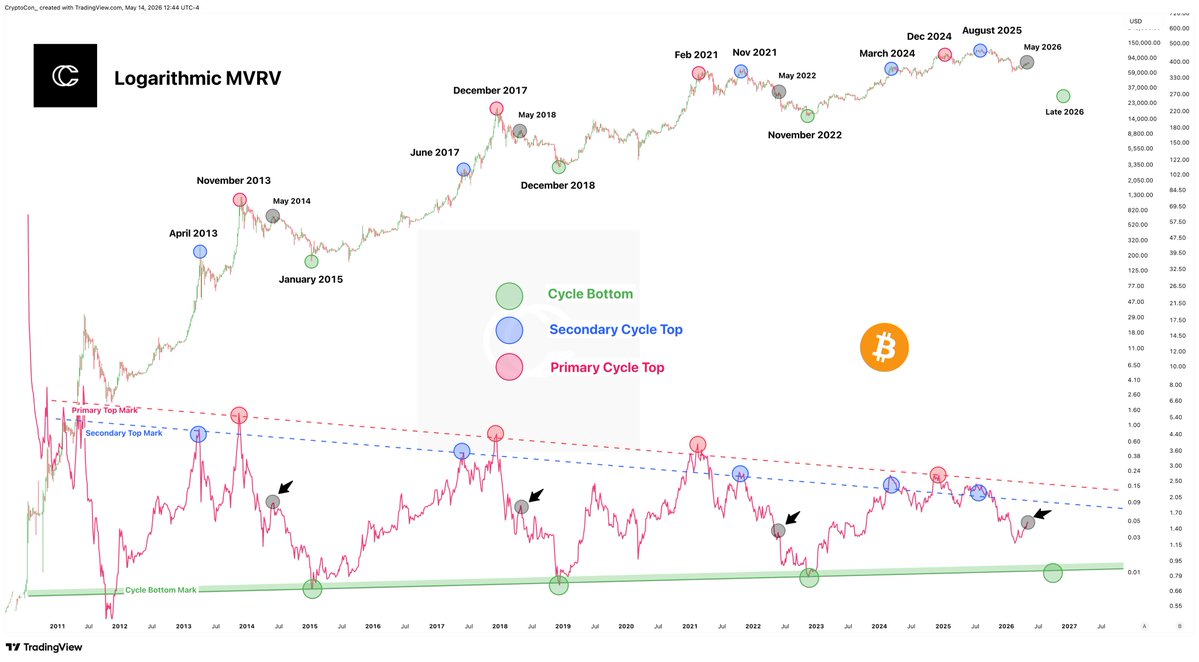
MVRV Pricing Bands remain one of the most reliable tools for identifying cycle extremes. Historically, Bitcoin $BTC has found its definitive bottom between the 1.0 and 0.8 pricing bands—the zones where the market is trading at or below its aggregate cost basis.
Since 2010, every major capitulation has found its floor within this narrow corridor. This is where the last sellers are exhausted, and the long-term accumulation phase begins.
In the current cycle, Bitcoin has yet to test these ultimate value zones. As of late April 2026, the bands are positioned as follows:
1.0 MVRV Band: $54,145
0.8 MVRV Band: $43,316
While the local momentum is positive, these levels represent the ultimate floor if the macro trend undergoes a deeper correction.
⚠️ATENCIÓN⚠️
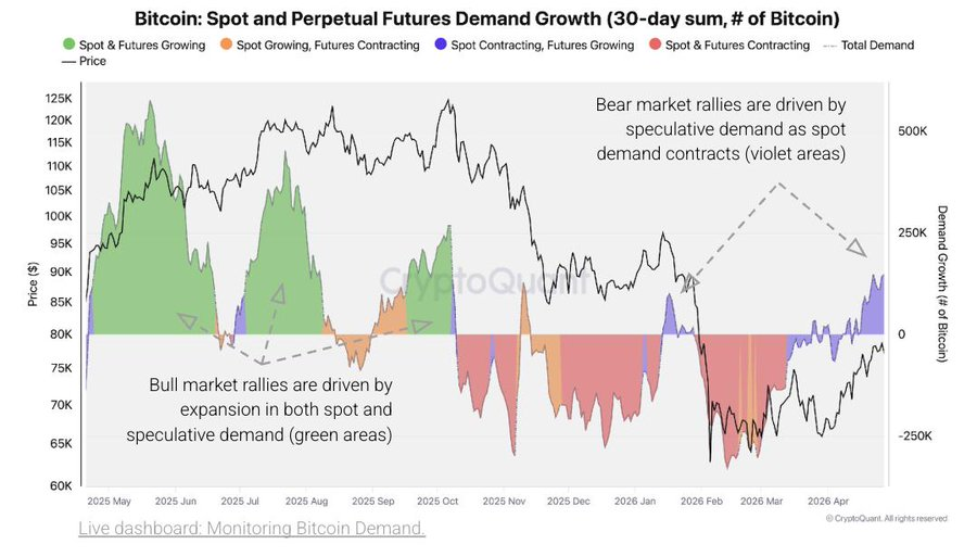
¡ALERTA DE CRYPTOQUANT SOBRE #BITCOIN!
El tipo de DEMANDA que está empujando a $BTC es exactamente el mismo que en 2022.
¿A qué se refieren con el "TIPO DE DEMANDA"?
👉 Demanda spot: compra real de Bitcoin. Alguien paga dólares y recibe BTC. Es demanda genuina que sostiene los precios de forma estructural.
👉 Demanda de futuros perpetuos: contratos especulativos que replican el precio de Bitcoin sin comprar Bitcoin real.
🎯 Lo que muestra el gráfico hoy:
▪️La zona violeta (futuros creciendo, spot contrayéndose) está activa ahora mismo en el extremo derecho del gráfico.
▪️El precio de Bitcoin está subiendo. Pero la demanda real, la spot, está cayendo.
▪️Esto lo vimos en los rallies intermedios de 2022, justo antes de los siguientes tramos bajistas más dolorosos.
¿Por qué eso importa?
▪️Cada vez hay menos compradores reales debajo para amortiguar.
▪️Los rallies impulsados por spot son diferentes: hay Bitcoin en manos de inversores de largo plazo que no venden fácilmente. Eso crea soporte real.
📍Todo apunta a la misma conclusión: el movimiento actual es especulativo. No tiene la base de demanda real que caracteriza los bull markets genuinos.
📍CryptoQuant: no garantiza el mismo resultado que 2022. Pero estructuralmente, la señal de demanda es bajista.
Plan C made one of the most fascinating discoveries this week - that Saylor's buying pattern follows a very neat logistic S-curve, or a common adoption curve.
I reproduced it myself and drew a few wild insights from it:
🟠 When optimizing the curve, Saylor's final stack size is projected to be 1.99M coins - only about 5% short of 2.1M (Come on, Saylor! 2.1M well within arm's reach!)
🟠 There is a wide range of possible final stack values: there is an ~80% probability he uliltimately stacks between ~1.34 and 2.67 BTC
🟠 There is an ~80% probability he practically finishes stacking between the years 2035-2039
Imagine looking back in 10 years, and remembering when you were saving in Bitcoin during the "Saylor Curve" years. Until that day, you can still consider yourself relatively early in Bitcoin.
If you're not following Plan C you're doing yourself a disservice. Follow him and his Saylor Curve! 👇🏻
https://t.co/r3n9W2xacR
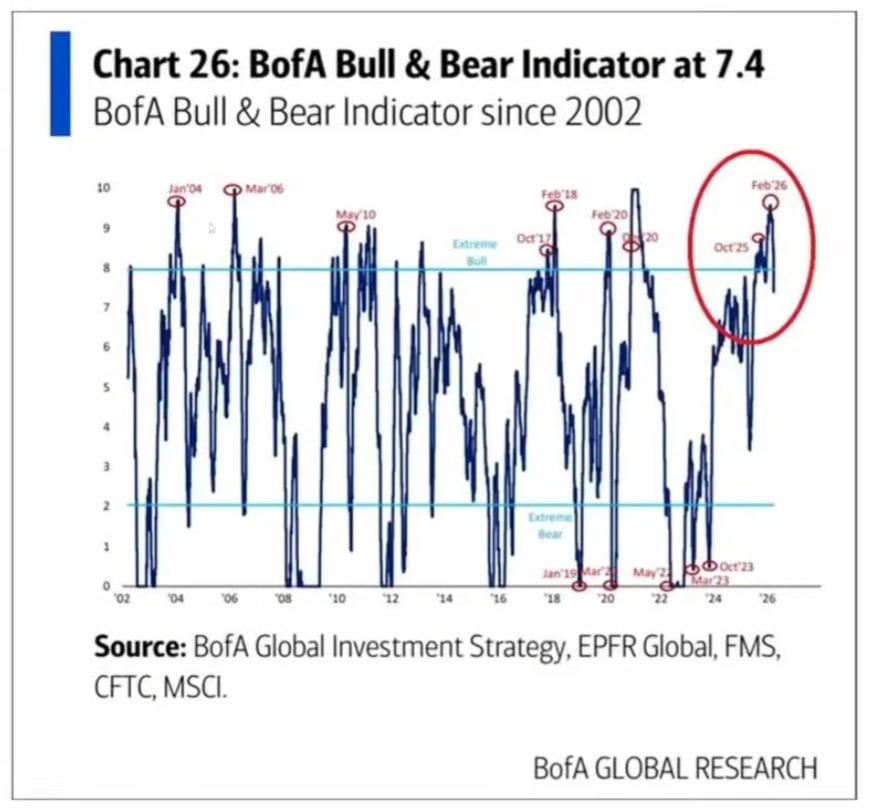
🚨ATENCIÓN🚨
SIN FALLOS DESDE EL 2002 (DEBÉS ENTENDER EL POR QUÉ DE ESTO)
🤯Bank of America tiene un INDICADOR que predijo cada TECHO de MERCADO DESDE 2002 y está confirmando uno ahora mismo.
💥 24 años de historial. Sin excepciones:
🎯El BofA Bull & Bear Indicator combina múltiples señales: flujos de capital, posicionamiento de fondos, sentimiento institucional, datos de amplitud del mercado y señales técnicas. Va de 0 a 10.
👉 Por encima de 8: zona de euforia extrema. Señal de venta histórica.
👉 Por debajo de 2: zona de pánico extremo. Señal de compra histórica.
👉Mirá los picos marcados en el gráfico con círculos rojos cuando el indicador superó 8 o rozó 10:
🔻 Enero 2004 → techo de mercado
🔻 Marzo 2006 → techo previo a la crisis
🔻 Mayo 2010 → techo del rebote post-2008
🔻 Octubre 2017 / Febrero 2018 → techo antes de la corrección de 2018
🔻 Febrero 2020 → techo justo antes del colapso pandémico
🔻 Diciembre 2020 → techo previo a la corrección de 2021
🔻 Octubre 2025 → señal previa a la caída
🔻 Febrero 2026 → nuevo pico extremo marcado con círculo rojo
¿Y dónde estamos ahora?
📍El indicador bajó desde ese pico. Pero aún no salió de la zona de euforia.
📍Lo que el gráfico sugiere es que estamos en la fase de "verificación del techo", el período donde el mercado rebota, da señales mixtas y los inversores debaten si el techo ya pasó o si el rally sigue.
📍Muestra que el setup para un techo de ciclo está completo.
📍Y en 24 años de historial, cuando ese setup se completó, el mercado no siguió subiendo indefinidamente.
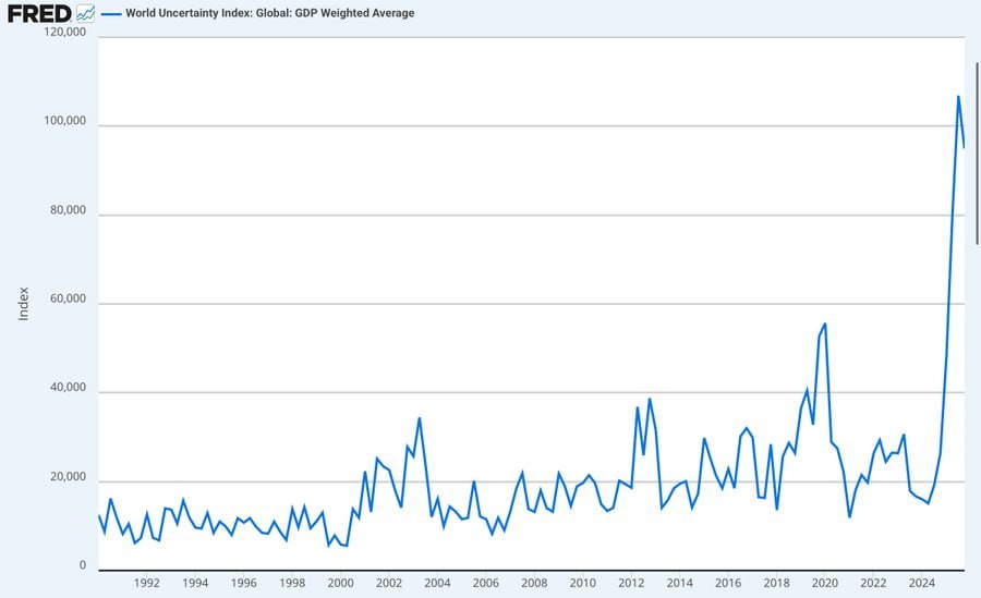
⚠️ATENCIÓN⚠️
EL MUNDO ENTRA EN SU MOMENTO MÁS INCIERTO DE TODA LA HISTORIA
📈El World Uncertainty Index (WUI) acaba de romper TODOS los récords:
😳Más alto que durante la guerra de Irak, la crisis de 2008, el COVID y la guerra comercial.
¿QUÉ SIGNIFICA ESTO⁉️
🔹El índice mide cuántas veces aparece la palabra “incertidumbre” en informes económicos globales
🔹Refleja cómo gobiernos, empresas y analistas ven el futuro: impredecible, riesgoso y difícil de modelar
🔹No anticipa un colapso inmediato, pero sí un entorno donde TODO puede cambiar de golpe
¿QUÉ PASÓ ANTES EN MOMENTOS SIMILARES⁉️
▪️2001 + 9/11: El SP500 ya caía, el pico de incertidumbre aceleró el crash
▪️2008 – Gran Recesión: El índice se disparó mientras el SP500 perdía casi -50% de su valor
▪️2020 – Pandemia: Crash del 34% seguido de QE masivo
¿QUÉ PASA CUANDO SUBE LA INCERTIDUMBRE⁉️
▪️Las empresas frenan inversiones
▪️Los fondos migran a activos líquidos
▪️Los mercados reprician TODO
▪️La volatilidad se vuelve " lo normal"
📍2026 es un entorno donde NADIE SABE. Y cuando nadie sabe… el mercado se vuelve un campo minado.
🚨 BITCOIN MAX SUPPLY IS NO LONGER 21 MILLION NOW.
And this is what causing market's crash.
If you still think Bitcoin price is moving only because of spot buying and selling, you are missing the bigger picture. Bitcoin no longer trades purely as a supply demand asset.
That structure changed the moment large derivatives markets took control of price discovery.
And that shift is a big reason why price behavior feels disconnected from on chain fundamentals today.
Originally, Bitcoin’s valuation was built on two core ideas:
• Fixed supply of 21 million coins
• No ability to duplicate that supply
This made Bitcoin structurally scarce.
Price discovery was driven mostly by real buyers and sellers in the spot market.
But over time, a second layer formed on top of Bitcoin, a financial layer.
This layer includes:
• Cash settled futures
• Perp swaps and options
• Prime broker lending
• WBTC products
• Total return swaps
None of these create new BTC on chain. But they do create synthetic exposure to BTC price.
And that synthetic exposure plays a major role in how price is set. This is where the structure changes.
Once derivatives volume becomes larger than spot volume, price stops reacting mainly to real coin movement.
It starts reacting to positioning, leverage, and liquidation flows.
In simple terms:
Price moves based on how traders are positioned, not just on how many coins are being bought or sold physically.
There is also another layer to this, synthetic supply.
One real BTC can now be referenced or used across multiple financial products at the same time.
For example, the same coin can simultaneously support:
• An ETF share
• A futures position
• A perpetual swap hedge
• Options exposure
• A broker loan structure
• A structured product
This does not increase on chain supply. But it increases tradable exposure linked to that coin.
And that affects price discovery.
When synthetic exposure becomes large relative to real supply, scarcity weakens in market pricing terms.
This is often referred to as synthetic float expansion.
At that stage:
• Rallies get shorted through derivatives
• Leverage builds quickly
• Liquidations drive sharp moves
• Price becomes more volatile
This is not unique to Bitcoin. The same structural shift happened in: Gold, Silver, Oil, Equity indices.
Once derivatives markets became dominant, price discovery shifted away from physical supply alone.
This also explains why Bitcoin sometimes falls even when there's not much spot selling.
Because price pressure can come from:
• Leveraged long liquidations
• Futures short positioning
• Options hedging flows
• ETF arbitrage trades
Not just spot selling.
So the current Bitcoin decline cannot be understood only through retail sentiment or spot flows.
A large part of the move is happening in the derivatives layer, where leverage and positioning drive short term price action.
This does not mean Bitcoin’s supply cap changed on chain.
The 21 million limit still exists. But in financial markets, paper Bitcoin is now dominating and this is what's causing the crash.
#Bitcoin is struggling to stay above its 1W MA50 lately and it's been under heavy pressure since the October 06 ATH.
This chart shows that the 1W RSI has been posting the same kind of Bearish Divergence (Lower Highs against the price's Higher Highs) it had during all previous Cycle Tops.
A weekly closing below the 1W MA50 would most likely come as a confirmation of the new Bear Cycle, whose 4-year thesis comes to an end in October.
If that's indeed the case and the top is already in, we can expect BTC to drop during this Bear Cycle to a minimum of $58000 (Fib 0.382 and 1W MA200) and maximum $35000 (Fib 0.618).
So is this the end of the Cycle?
Full description on our Telegram channel:
👉https://t.co/LY11ipAPtB
LIKE 👍, FOLLOW ✅, SHARE 🙌 and COMMENT ✍ if you enjoy this analysis!
#Bitcoinsignals #BTCUSD #BTC #BTCUSDT #signals #crypto #trading #cryptocurrency #tradingsignals #cryptosignals #cryptotrading #investing #tradingtips #tradingstrategy
⚠️ATENCIÓN⚠️
📉La RECESIÓN INDUSTRIAL en EE.UU se profundiza… y ya impacta en el EMPLEO. Hay analistas que están prediciendo un RECORTE del 0.5% para Septiembre
💥Un cuarto de las manufactureras está recortando personal y el PMI ISM sigue en CONTRACCIÓN
¿Qué está pasando y por qué es CLAVE para el mercado⁉️
🎯El PMI ISM manufacturero cayó a 48.0 en julio
▪️Mide la salud del sector manufacturero en Estados Unidos
▪️Proporciona información sobre la actividad económica, incluyendo nuevos pedidos, producción, empleo, entrega a proveedores e inventario
▪️Es el nivel más bajo desde noviembre de 2024
▪️Y marca el 5º mes consecutivo de contracción
▪️La industria ya se achicó en 31 de los últimos 33 meses
▪️El subíndice de NUEVAS ÓRDENES también lleva 6 meses en contracción
🎯El DATO MÁS ALARMANTE: el EMPLEO industrial se está desplomando
▪️El subíndice de empleo cayó a 43.4 puntos
▪️Es el peor nivel desde 2020
▪️Y el 25% de los fabricantes reportó recortes de personal
▪️Es la cifra más alta desde junio de 2020 (plena pandemia)
¿Qué significa esto para #Bitcoin, acciones y tasas⁉️
-Una desaceleración tan fuerte en el sector industrial debería llevar a recortes de tasas
-Más recortes = más liquidez
-Si la FED no lleva a cabo los recortes, los mercados podrían entrar en pánico por una eventual RECESIÓN
📍La industria de EE.UU está pidiendo ayuda a gritos
¿Pensás que la FED va a recortar la tasa 3 veces este año como lo espera el mercado⁉️
Gráfico: @KobeissiLetter
The chart shows a consistent bullish pattern: every time the 30 day percentile funding rate across major exchanges dropped to around the 50% level (green circles: September 2023, May 2024, September 2024, and April 2025), it coincided with a local bottom phase, followed by a resumption of the upward trend.
After the last bottom in April 2025 and the subsequent rally to $112K, the current percentile stands at 54%. With this setup, the bullish trend maintains momentum, and the next level of attention will be the 80% mark a breakout above this level would signal excessive enthusiasm and correction risk.