📊 Today's webinar "Datawrapper's API with R" starts at 12pm EST / 6pm CET. Still time to register and bring your questions for the live Q&A: https://t.co/XTHeFjLDeP
This week's visualizations cover the Swiss population cap 🇨🇭, Elon Musk's trillionaire status 💵, El Niño 🌡️, and underground fungi networks 🌎. Explore these topics and many more in the newly posted Data Vis Dispatch👇
https://t.co/G9J2TGdq2o
Let’s see how the Design Community is getting inspired with maps
- Landscape architecture grad student adds too many lines to site plan
- Old map vandalized with Blender shaded relief
- Portolan map
- That cool twisty map of Mississippi River meanders
- Bizarrely-tinted version of the 1978 Nat Geo masterpiece "Heart of the Grand Canyon"
- AI slop
It's not easy having the only crumb of map discernment on the whole, entire internet
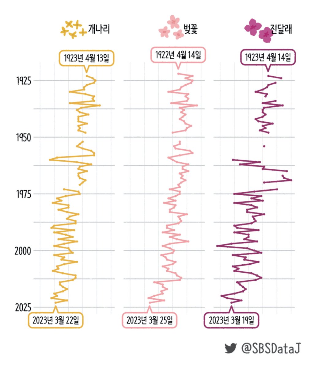
New Data Vis Dispatch! This week you'll find charts and maps covering early spring in Korea, the war in Ukraine, anti-LGBTQ bills in the U.S., and much more. 📊👇
https://t.co/RlLuDymoud
🎉 You can now draw arrows in Datawrapper locator maps! Choose between line arrows (to show routes) and flow arrows (to show magnitude too), and style them however you like.
Learn more: https://t.co/7gkMtmXllW
🇨🇴 How do you visualize an election?
A scroll-driven story: Colombia's map morphs step by step into 1,189 bubbles, one per municipality. Scroll through it and compare every presidential race since 1974 👇
https://t.co/nc5hUgbmEL
#Colombia#DataViz
The Sonoran and Mojave Deserts are incredibly diverse, serving as habitat for migratory birds and wildlife.
USGS researchers and our partners combined satellite data, decadal plant growth cycles, and extensive ground verifications to map nearly 148 million acres at a sharp 30-meter resolution.
The resulting framework classifies 152 different vegetation and land cover types across both the United States and Mexico. Hosted as an interactive online tool by @uarizona, this map can be rapidly updated with new field observations to detect environmental shifts over time.
This non-biased science provides foundational data to regional public land managers, helping them understand habitat distribution and plan for long-term resource stability.
Download the report and see the full map here: https://t.co/v8MbPlX9Kp
📸: High-resolution Transboundary Vegetation Community Maps of the Sonoran and Mojave Desert Ecoregion to Support Critical Landscape Conservation Planning and Habitat Management Needs.
@uarizona@wildlandsnetwrk@sonoranjv
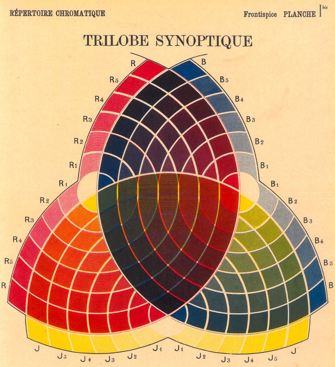
Charles Lacouture, Trilobe Synoptique (1890).
Created before the modern RGB color model, the diagram attempts to map all colors through combinations of red, yellow, and blue, reflecting 19th CE theories of pigment mixing and color harmony.
Chromolithograph on paper.
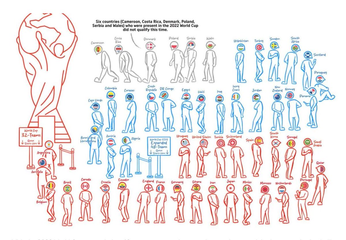
The 2026 World Cup is just around the corner, and the latest Data Vis Dispatch brings you a batch of visualizations to mark the event 🌎⚽️🏆. Find these and much more on the Datawrapper blog. 👇
https://t.co/kAHJhgrzTb
🌎 What does it take to make massive imagery datasets web-ready? Join geospatial expert and YouTube creator Matt Forrest (https://t.co/4scKzu4Ig0) for Modern GeoTiling Techniques for Web Maps.
🗓 June 18, 12 PM ET
🗺️ Free virtual event — sign up:
https://t.co/1eStxsCFFV
🎉 We've updated our population cartogram with the latest (2023) data from @OurWorldInData! A lot has changed since the 2018 one, which used 2016 data.
Create your own at https://t.co/4f30kEheQI > Choropleth map, then search for "population squares."
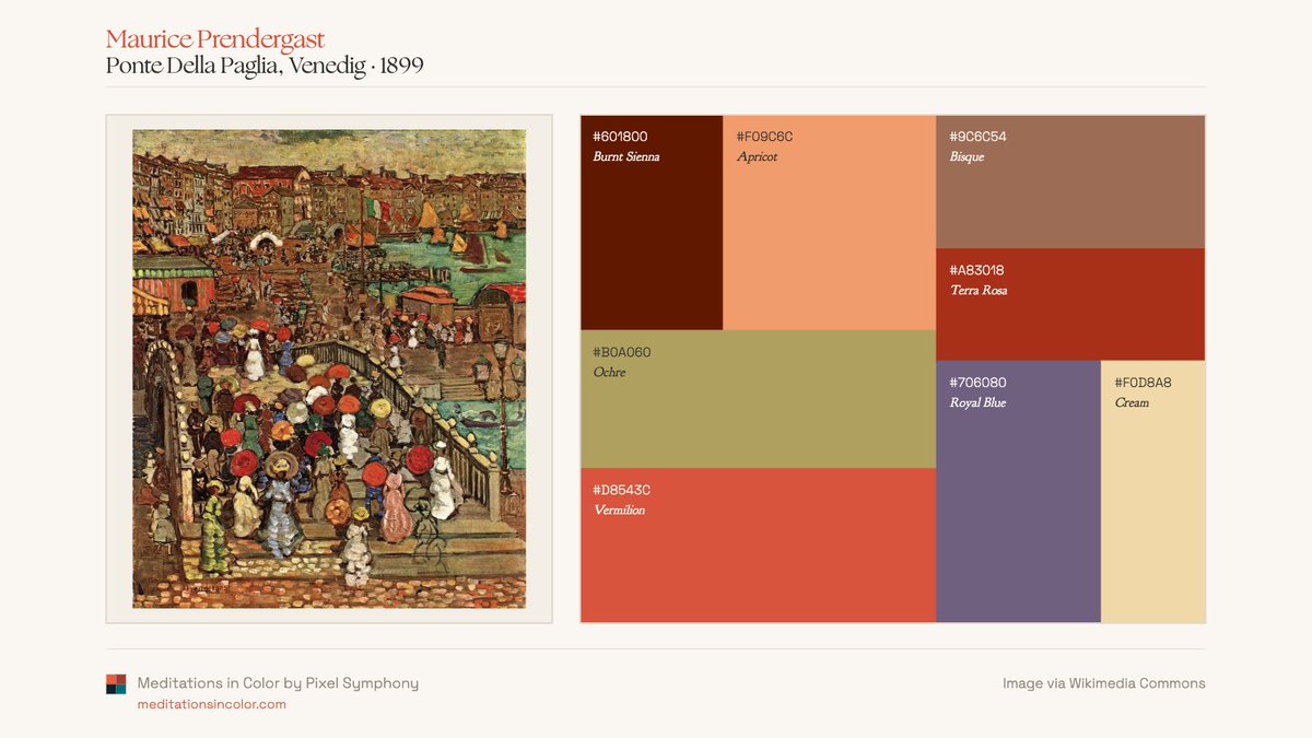
Maurice Prendergast's color world.
Across beaches, gardens, promenades, and parks, Prendergast returns to the same chromatic vocabulary: ochres, creams, blues, greens, and bursts of orange.
Four palette readings from Meditations in Color.
Tobias Mayer’s triangular color chart (1758).
Created by an astronomer and cartographer, it was an early attempt to represent color through geometry than symbolism or pigment alone.
Later reproduced by Georg Christoph Lichtenberg in Opera Inedita (1775).
📍Las desapariciones en México tienen historia.
No comenzaron ayer y tampoco han terminado.
Por eso construimos una línea del tiempo interactiva 🧭 que conecta hechos, contextos y momentos clave para entender cómo esta violencia se ha expandido en el país.
Detrás de cada fecha hay personas desaparecidas, familias que buscan 🔎 y años de exigencia ante la falta de respuestas.
Explórala aquí ⬇️
https://t.co/TPMwwNZehi
George Hurst, Colour (1900).
Hurst was a Scottish chemist, dye expert, and color theorist.
Looking back, many of these diagrams feel unexpectedly modern. Looking forward, they helped establish some of the foundations on which 20th CE color theory would be built.
1 of 2 👇
Meet the #Outlier2026 speakers presenting on "Data Sonification". Join us June 24 to 26—register today: https://t.co/dVDS5AeBBh
Everything I Know about Visuals I Learned from Sound by Robert Simmon
¿Y si pudiésemos ver cada edificio de Madrid a lo largo de la historia?
Ya he conectado cerca de 900 licencias de obra del Archivo de Villa con su ubicación en un mapa interactivo.
Pronto en https://t.co/0Gru1PKT3m.
¿Cuál fue el resultado de la elección Colombiana del fin de semana? @duto_guerra@guerravis presenta un análisis muy completo a través de 3 interactivos que revelan los detalles de la elección en muchas de sus dimensiones. Enlace 👇