📱 Introducing Screenmotive.
You spent months building your app. Your App Store page should reflect that.
• App Store screenshots
• iOS 27 headers & animations
• App preview videos
• Search result creatives
• Social launch videos
Delivered within 24 hours.
@JustinPerea Building for the Duo before you even hold one is a bold move.
When these ship, record the fold and unfold moment early. It's the clip a preview video needs, and it explains the idea faster than any caption.
@LiamOrourke10 App Review always takes longer than you'd hope. Good luck with RYX.
While you wait, consider giving accessibility its own screenshot with one plain line about it. For many people it's the first thing they check.
@thegreatgabuza One thing worth checking before launch: the ad and screenshot one should make the same promise.
When people tap through and the store page tells a different story, they bounce, and the install cost looks worse than the creative really is.
@InkCalc Your App Store description opens with a great example: hourly pay in plain words, tap AI, get the total.
The screenshots show code-style syntax instead.
I'd make that sentence-to-answer moment screenshot one. It shows what's different in a second.
@losmaglor Nice timing for spooky season.
Event cards also show up in App Store search, so the event image works like a bonus screenshot.
A costumed version of the Octoshield mascot would stand out there 🎃
@playonetwosheep The pastel meadows look lovely.
Screenshot one leads with the level count, but the rule is what makes people curious.
I'd put the one-line rule there instead: one sheep per row, column and colour, none touching 🐑
@SofaVardazaryan Welcome, and congrats on getting ScanCortex live 👋
Screenshot one shows the empty home screen with no documents yet.
I'd swap in a finished scan, a crisp page with its text already pulled out. That's the moment people download a scanner for.
@VhirtyStudio I'd give it an 8. The warm red and serif type really stand out.
Screenshots 3 and 4 both show date lists, so one could show a reminder.
Unless Apple featured you, I'd drop the App of the day badge. Review can flag it.
Free notes: https://t.co/bMB4csV9Zo
@maxupsidehq Totally fair, and thanks for letting us know.
Good luck with the SwimTune rewrite. Happy to take a look once it's live if you ever want a second pair of eyes.
@casparbuilds@maxzrco Hey Caspar, saw you're testing Apple's ad credit on Sprout. The name says ADHD, but "Made for ADHD brains" only shows on screenshot 4, so ad taps don't see it first. iOS 27 Header Pack, $19, 3 headers plus search image: https://t.co/cuhgw0pqHQ
Want an ADHD-first header?
@RomCrate Profile levels and Duo support in one release is a nice combo.
For the store, a screenshot of a profile with a badge just earned would show the new loop better than a feature list.
@iamferdieUX The corkboard is the screen I'd lead with on the App Store. It shows what ManuscriptFlow is for in one image.
Focus mode and Quick Jump can follow on screenshots two and three.
@100rabhAi Hindi and Punjabi coaching is a real differentiator.
When you get to screenshots, consider Hindi headlines on a localized set too. A page in the reader's own language makes the point before they read the description.
@growwyas Good two questions to start with.
Keywords answer the first. Your icon, subtitle and first three screenshots answer the second, since that's all people see in search before they tap.
Looking forward to your notes.
@itschrisanto13 Congrats on the first annual subscriber.
Traffic from Threads, TikTok and IG lands on your App Store page, so screenshot one does a lot of work. I'd make it a photo turning into a palette, readable at a glance.
@KenRemind Ethiopian dates on the outer screen is a lovely Duo use case 🇪🇹
A Duo screenshot with the folded and unfolded views side by side would show both modes before anyone installs.
@Driftlog_app Nice update. The live set already opens with a strong line on screenshot one.
In the new set, no account, no ads, no subscription deserves its own screenshot. For an app that reads your photo library, that line builds trust fast.
@soumya_mahunt Congrats on your first app 🌱
The screenshots show clean gameplay, but the tip text at the top is doing all the explaining.
I'd add a short headline to the first one, like Every fall changes the maze, so the hedge idea lands at a glance.
@YallaSaikalyan Congrats on shipping PantriX, your first iOS app.
The third screenshot is Settings, with a demo email still showing.
I'd swap in the What can I make? screen. Leftovers into dinner is the part people want to see.
More free notes: https://t.co/bMB4csVHOW
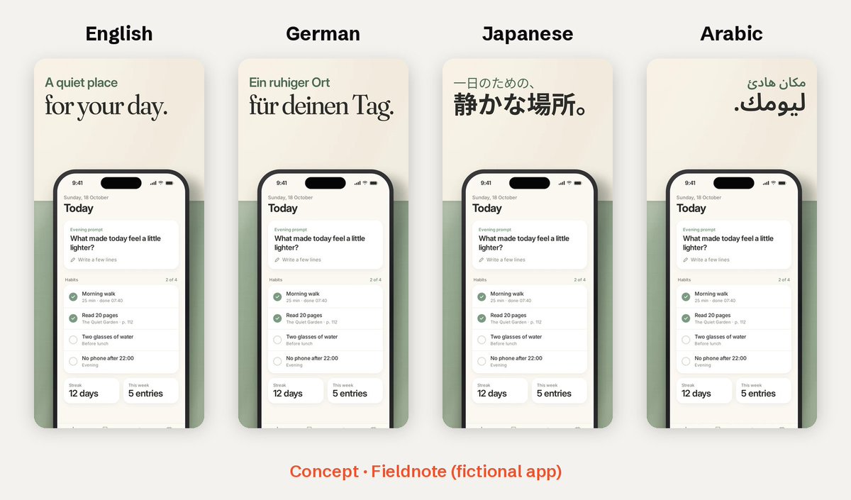
Planning to localize? Keep your screenshot headline short 🌍
"A quiet place for your day" is six words. In German, Japanese and Arabic it still fits on two lines, so the layout stays the same.
Long ones wrap or shrink, and each language needs its own fix.
Concept · Fieldnote