We have updated the graphs with the latest data from @gcarbonproject. Now they show when countries need to be CO2-neutral as of 2026. It is needless to say that the world is running out of time.
We have updated our site with the latest data from the Global Carbon Budget. Now the budgets starting on January 1, 2025, are available for all countries:
https://t.co/eQbNLNLHtW
In what kind of global climate have your family members lived, and how will they live in future?
What legacy would you like to leave them?
Fantastic tool by NASA: enter names and birthdays of your loved ones to get their personalised climate timelines! https://t.co/Vr2hl1OTDY
This graph is a testament to how absurdly warm global sea surface temperatures have been over the last 12 months. Out of all the data visualizations I have posted on here so far, this might genuinely be the most alarming one.
2023 was the warmest year on record globally by a large margin. Another dark red stripe gets added, though I think I need a new colour.
#ShowYourStripes
1/2
Another year, the big paper on the Global Carbon Budget is out, 2023, with complete data to 2022 & projections for 2023
Fossil CO2 emissions up, land use change emissions down, natural CO2 sinks are maintained, CO2 concentrations continue to increase
https://t.co/eikBFgAtho
Daily warming sea surface temperature stripes:
Each day from Jan. 1, 1982 to yesterday is marked by a color showing the difference between that day's global average sea surface temperature and the 1991-2020 baseline average for the same day.
2023 stands out ever so slightly.
@joeloyo . @joeloyo, do I see correctly that the CO2 levy is nowhere mentioned in the new strategy? Does that mean it will not be discussed further in future?
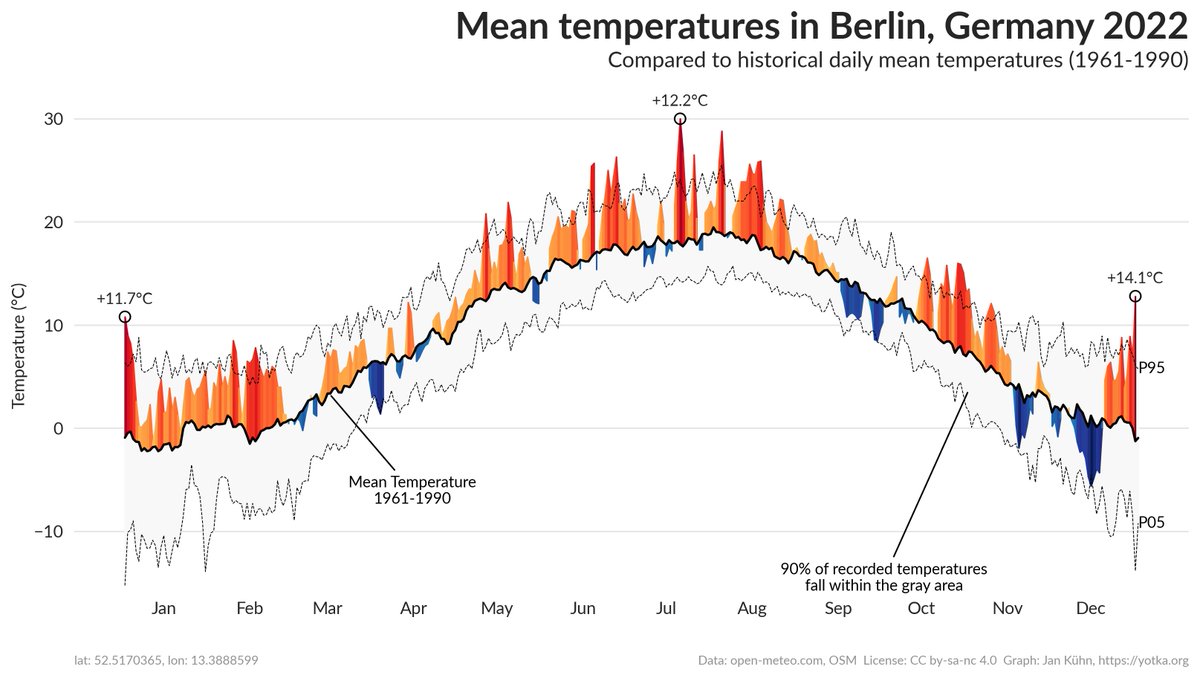
We know #GlobalWarming is real. But how have temperatures developed in different locations around the globe?
I built a web app that creates graphs like this for most places on earth. It shows how daily temperatures compared to a reference period (by default 1961-1990).
#dataviz