cool use case of chatgpt work i heard last night:
connect your family calendars and explain your kids' interests.
every morning for the drive to school, have it make a podcast that talks about one kid's soccer game that afternoon, one kid's upcoming birthday, some news, etc.
Coca-Cola's new global redesign made Zero Sugar look almost identical to Classic, with just a thin black ribbon to tell them apart.
The immediate critique: "Consumers are going to grab the wrong can."
I see a masterclass in portfolio strategy.
Why top brands intentionally blur their product lines:
> Absorbing equity to lower friction
When you wrap an alternative SKU in the high-equity visual language of your flagship, you erase the psychological barrier to trial. Choosing Zero Sugar no longer feels like settling for a compromise. It just feels like buying a Coke.
> Reframing the hero
As former Coca-Cola exec Courtney O'Brien told me, Coke Zero was built as a challenger brand. Now, Coca-Cola is pulling that equity back into iconic Red so the brand name (not full sugar) is the hero. Classic becomes heritage; Zero Sugar becomes the default future.
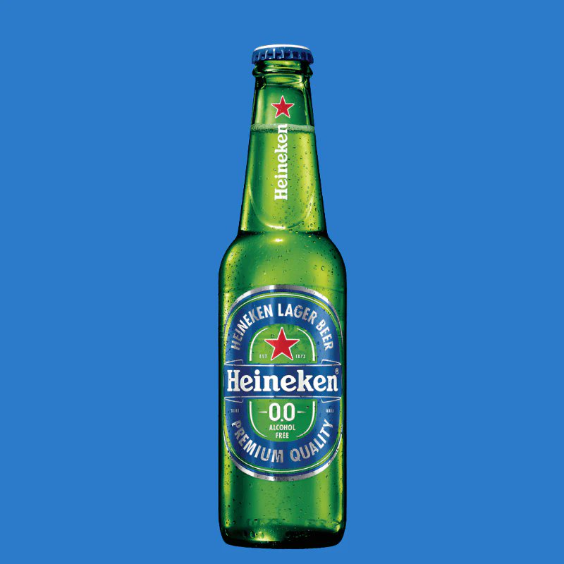
We've already watched this playbook win in non-alc beer. Brands like Heineken and Guinness wrapped their non-alcoholic SKUs in their core iconic branding for the same reason: as societal scrutiny around alcohol (and sugar) grows, visual continuity makes the shift feel seamless.
Will there be short-term friction at the shelf? Absolutely.
But Coke is trading minor baseline confusion today for category dominance tomorrow.
Great branding asks: "Where do we need our customers to be in 10 years, and how does design guide them there?"