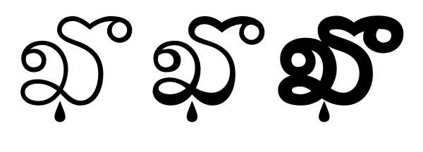
@simoncozens @OhBendy @GranshanConf Are these literally two alphabets, or actually two styles of one. We say one is "writing" and the other "printing", which may be a clue;)
@TiroTypeworks@benkiel@ninastoessinger@rileycran You've been pushing the base table since 2016 and have never supported, documented or demonstrated anything else on our presence.
And "everyone" does not think I'm talking about UPM scaling, that was answered in the first conversation with MS on this issue and you were present.
@TiroTypeworks@benkiel@ninastoessinger@rileycran Microsoft, Tiro Typeworks and Armenotype, Granshan, Apple and Adobe, have all rejected the independent interoperable variation of vertical metrics in any script, much less among them. The em is latinized and that is apparently final.
@davelab6@TiroTypeworks@_Undt@alannamun@eliheuer@typeoff @rosettatype @nan_xyz_@typeler There are, I think, already other scripts hiding in plain sight with a need for registered alignment axes. Remember always, that not registering OS/2's vertical metric as axes was "the" test for how serious MS was about the spec, and if the type industry was about type or wool;)
@hhpapazian@davelab6@glyphe@googlefonts@kupfers@arabictype No other links or topics yet, thanks. Grade as the name of the axes and as a value given to styles along it, in both incarnations, is "even more confusing" than what? And what does it mean to have one word "doing more of the work" than another? How does "three" outwork "Grade"?
@typographica Thanks for the opportunity to give you a broader view. You present the use of font products that benefit “normal” readers for as vast a discussion as you can get...further reading has been provided.
@hhpapazian@davelab6@glyphe@googlefonts@kupfers@arabictype "Grade" in instances was part of a style name, but always joined by names like "one", "two" or "three". In variable fonts, the transition to an axis with numerals should not be confused by this change, and has overwhelmingly not been. Thanks.
@TiroTypeworks@dberlow@adamtwar@TypeNetwork@googlefonts@davelab6 We think your exaggeration is funny because we're getting someplace where it counts. Disagreeing on how to present it in a particular way so Latin users may understand more easily, is just more Black/white vs opq/tra, x /y vs y/x, per mille vs whatever...
@TiroTypeworks@googlefonts @OhBendy @dberlow@TypeNetwork@davelab6@octaviopv@elliotjaystocks Tiro, if "elsewhere" is that cartesian transparency is something we "mark" via sidebearings and kerning pairs, no stress is possible. On the other hand the opaque of type is pretty obviously not strictly used in a cartesian manner. We've covered that with our framework.
@TiroTypeworks@googlefonts @OhBendy @dberlow@TypeNetwork@davelab6@octaviopv@elliotjaystocks Thanks for remembering, that all fonts, while designed with an often complex hierarchy of values, values that may be used in the type design process, must be compressed to 1 value in OT. To design another any other glyph without "telling yourself" that value, is up to you.
@TiroTypeworks@googlefonts @OhBendy @dberlow@TypeNetwork@davelab6@octaviopv@elliotjaystocks Thanks if you pick up a marking tool and look to see if it has x and y of its own. Watch people use a marking tool. We think OS/2 values are more inaccurate and more misleading than our framework, relative to typography, but that's news old enough now to be fonts that prove it.
@googlefonts@hhpapazian@Igor_Freiberger@TypeNetwork@dberlow Sounds fishy for someone who hasn't driven it to decide the engine's bad. Besides which, we only built the chassis, cabin, steering and accelerator. The owners of the spec built the engine, (and failed to deliver the brakes on time for this build).😇
@googlefonts@hhpapazian@Igor_Freiberger@TypeNetwork@dberlow Looking may take some time. There are a lot of sizes between "text" and "display." There are a lot of uses considered as both, neither or either, based on reader, distance, script, drift and much more...we wish we knew. Even if found, to dictate such a thing seems... autocratic.
@realdougwilson Thank you for your follow up. The designer thinks working on an essay surpasses twitter in answering questions, rhetorical or otherwise.
Will send you a copy in advance, if you ask?