Globally, women spend 2.5 additional hours on unpaid care and domestic work compared to men, reflecting traditional gender roles.
Learn more about the disparities by exploring this #SDG5#dataviz 📊
https://t.co/cEhujgcuVU #SDGAtlas
Data visualization is a powerful tool that can help you make sense of complex data.
And a heatmap represents the magnitude of a phenomenon through colors.
In this guide, @VisualScribbler shows you how to create an interactive heatmap using JavaScript.
https://t.co/BiMEkNPnm5
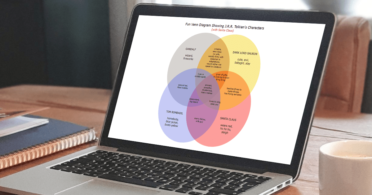
📬 Venn diagrams are a useful tool for showing similarities & differences among sets of items. Check out this tutorial to learn how to quickly create them in JS, where @VisualScribbler remakes @TeawithTolkien's fun Venn(s)!
👉 https://t.co/aEsMx7EmJM
#javascript#webdev#dataviz
Data visualization is a big field - and there are tons of different types of charts you can create.
But certain charts will always be useful - like line charts.
So @VisualScribbler wrote this fun guide to teach you how to create one in JavaScript.
https://t.co/uXjigXpC7n
The effectiveness of the declutter and focus #dataviz guidelines were untested until recently. Find out what @SteveFranconeri & his students from
the Visual Thinking Lab & @storywithdata found out when they tested these techniques. https://t.co/oY0gruvmSl
💥 Just posted a fabulous guide to stacked charts! 🤩
Definition❓ Types❓ How to create❓
✅ Questions answered!
🏅 Beijing 2022 medal counts visualized for a fun illustration!
Thanks @VisualScribbler 🙏
#javascript#frontend#webdev#coding#dataviz https://t.co/7F8V3eOyIN
@Guvvalapavanku1 Thank you🤗I haven't coded this - just made a fun chart with the designing done in Canva! Not an efficient method for sure!😅 But if I had to make it dynamic I would probably use d3.js 😁