stay true to the medium
the “liquid glass” approach to design is peak “design system” gone wrong — when you optimize for visual consistency over interaction fidelity, you lose the soul in each medium.
each input method has its own physics and affordances. touch needs bigger targets and gestures; mouse wants click, hover, press, release, precise cursors; keyboards need focus, press, combos and modifiers. when you force the same visual language and patterns across all of them, you’re basically saying “fuck the user’s actual experience, i just want my design reviews to look nice.”
it’s like... imagine if we made chopsticks, forks, and spoons all look identical. sure, your kitchen drawer would be “consistent,” but good luck eating soup with chopsticks.
apple used to get this — classic mac os had different UI paradigms for different contexts. Aqua brought us to the internet age with hand-crafted reality, each icon with characters, yet strikingly cohesive. apple also knew not to directly transplant this to the first iPhone OS, but perfectly fitted to touch. but now everything's becoming this homogeneous glass blob because it's easier to maintain one design system than to respect the medium.
the real disease here is prioritizing brand over the craft beyond the visuals. when designers stop asking “what’s the most natural interaction for the pros who want precision?” and start asking “how do we make this look just like our other stuff?” you get interfaces that look pretty in pre-recorded keynotes but feel dead in your hands.
we should be designing for the conversation between human and machine, not for the screenshot. each medium deserves its own language — not a translation of some universal corporate speak.
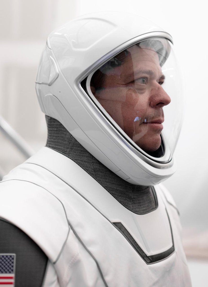
Tomorrow, @NASA astronauts @AstroBehnken and @Astro_Doug will fly from their home base at @NASA_Johnson to @NASAKennedy aboard an agency Gulfstream aircraft. ✈️🚀
Tune in to NASA TV at 4 p.m. ET on May 20 for the crew arrival news conference: https://t.co/w152mMNVra