The Fonts In Use team unanimously condemns the assault on safety, security, and basic humanity continually displayed by Twitter’s new ownership. We loved it here, but can no longer justify engaging in this platform. Find us at https://t.co/sUgAgKsHuV and https://t.co/dV2ePZveBN.
@domesticetch Fully agreed!
@JonathanHoefler Not Welo, but Carlyle & Oring: https://t.co/bgi2UdxObC
@ZAlexSnyder It wasn’t a font at first, just a piece of lettering. Someone turned it into a photo typeface in or before 1969.
We just added two more in-use examples:
https://t.co/Nc43Y8Br4E
The Fonts In Use team unanimously condemns the assault on safety, security, and basic humanity continually displayed by Twitter’s new ownership. We loved it here, but can no longer justify engaging in this platform. Find us at https://t.co/sUgAgKsHuV and https://t.co/dV2ePZveBN.
On Dec 13 we posted the tweet shown in this screenshot. Tonight, that tweet is hidden, replaced with an ad, as part of Musk���s hamfisted/fascistic ban on all Mastodon links. So, we can’t link you to our social network of choice, but you can get there from https://t.co/VV5wlojAhW.
@olofch@hardwig Hi Thomas, it appears to be related to Brasilia https://t.co/BEXxibQ1ll
Not PL/MT’s digitization, though. AFAICT, neither Bolivia nor Neue Brasilia
https://t.co/xKvCyRFJaj
https://t.co/raUSp1RIMr
For future font ID requests, please consider asking at https://t.co/wsT1ronytx
@EvaSilvertant Thanks a bunch, Eva! That’s very kind. I really wanted to show that lc ‘g’, so I caved and compiled a mixed-case sample: https://t.co/Ew2lAo5bkN
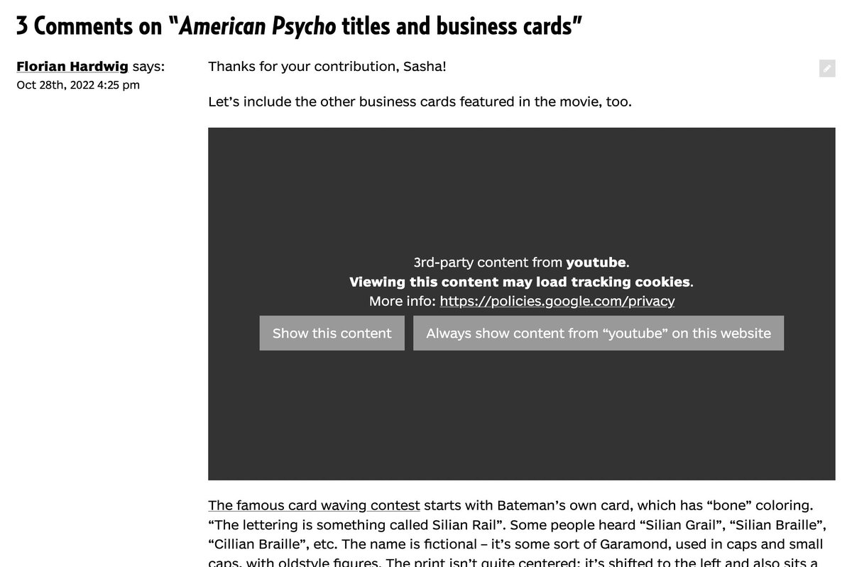
The only exception is when you encounter embedded content from another site, such as a YouTube video. We present a warning before loading the content so you can choose whether to load that cookie.
Here’s a little info about the third-party cookies on https://t.co/VV5wlojAhW:
There are none.
Last year, as our team discussed GDPR conformity, we agreed it was easier and better to drop any need for cookies than to have an opt-in popup.
Receipts: https://t.co/wejldcnZe2
They say not to judge a book by its cover, but a great cover helps readers forget that advice. Here are ten excellent covers that prove the importance of high quality typefaces and typography.
👉 See the list and read the article here: https://t.co/0RPu1mKFxr
@jmsoleb Yes, it’s indeed the AT Vol. 2 from 1965. Similar samples are also shown in the One Line Manual of Styles from 1971, just smaller and w/o the stretched and obliqued variations.
@EvaSilvertant Stylistic alternates, the DIY (and anti-SEO) way: those glyphs are the Cyrillic pe (п) and the Greek upsilon (υ)!
For fonts that offer angular (and other) alts via OT features, see Programme, Euclid Flex, Cy:
https://t.co/PybLzqCVuV
https://t.co/gDWUQ9BPdR
https://t.co/YfL2iZu8yK