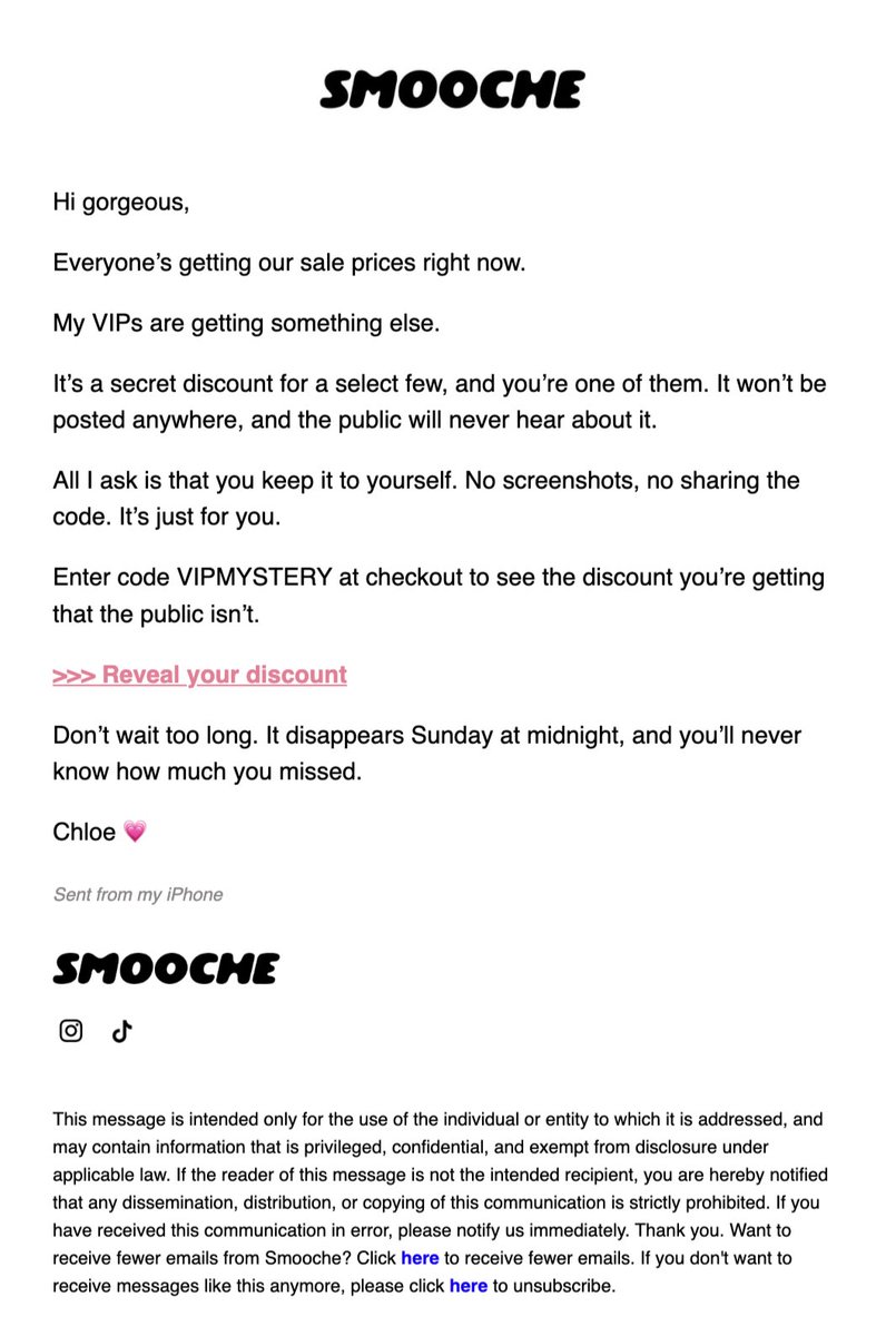
If you want to go AGGRESSIVE on a sale… this is what to do.
The discount itself might be normal from Smooche. The psychology surrounding it is what makes it very different…
Here’s some examples used in the copy:
👉 “Handpicked just a few”
- This creates exclusivity and makes the customer feel selected.
- People place more value on opportunities that aren’t available to everyone.
- They aren’t receiving a discount because the brand is desperate for sales. They’re receiving it because they were supposedly chosen from a larger group.
👉 “You’ll never know unless you reveal it”
- This opens a curiosity gap and FOMO.
- Now the customer isn’t being asked to buy anything—they’re simply being asked to discover what they received.
- That makes the first click feel effortless. Once they reveal the offer, they’ve already engaged and are one step closer to using it.
👉“It’s been used 363 times. That leaves 137 uses left.”
- This combines social proof with scarcity.
- The 363 uses show that other people are already taking advantage of the offer. The 137 remaining uses tell the customer they could lose access if they wait.
- The specific numbers also make the limit feel more believable than saying something generic like “limited quantities available.”
👉“VIPs like you deserve something better”
- This appeals directly to the customer’s identity and status.
- They’re being recognized as a VIP and rewarded with something the general public doesn’t receive.
- It also uses contrast: everyone else gets the public offer, but you deserve something better.
👉 “Keep it to yourself. No screenshots… It’s just for you.”
- Secrecy makes the offer feel even more exclusive.
- If customers are told not to share something, they assume it must be valuable enough to protect. It makes them feel like an insider with access to something other people aren’t supposed to see.
“It’s just for you” also creates psychological ownership. The discount already feels like theirs, so not using it feels more like losing something than simply passing on an offer.
That’s the bigger lesson here... saying “20% OFF” is lazy and boring. Mix in creative ways of using psychology to your sales.
The discount may be the same… but the framing completely changes how valuable it feels.
(Not my emails)
🎨 How to Use Design Psychology to Make People Buy Without Feeling Sold To
Most brands try to convert through pressure. Smart brands convert through comfort.
1️⃣ Warm, Soothing Aesthetic = Emotional Safety → Soft peach tones, rounded edges, calm typography. It doesn’t scream “Buy now.” It feels trustworthy.
🧠 Emotional design can boost conversions by up to 200% because buyers follow feelings, not logic.
2️⃣ Doctor Endorsement = Instant Authority
→ “Approved by Professionals” + real name, title, and quote. That’s social proof elevated — it tells shoppers, “You’re safe here.”
📈 Expert validation can increase purchase likelihood by 42%.
3️⃣ Offer Framing That Feels Generous
→ “Buy 1 Get 1 Free” + “Subscribe & Save 30%.” Instead of pushing scarcity, it creates a win-win perception.
💰 Clear, value-focused offers lift CR by 25–40%.
4️⃣ Visual Hierarchy That Guides Naturally
→ Benefits → Offer → Trust → CTA. Every section flows like a story, not a pitch.
🧩 Structured information flow can raise engagement time by 60%.
5️⃣ Empathy Through Copywriting
→ “Supports Vaginal Health,” “Restores Balance,” “Clinically Studied.” It’s not transactional,it’s understanding the customer’s pain.
💬 Empathetic messaging can increase checkout completion by 1.5–2x.
⚡ Pro Tip:
Don’t make your pages louder, make them warmer. When people feel seen, they don’t resist the sale.
Add a free-gift progress bar to your cart drawer.
"You're $18 away from a free gift 🎁"
It nudges AOV up without a discount. You're giving a gift, not cutting margin.
One of the fastest wins on Shopify.
Your product doesn't increase AOV your page structure does.
Every extra click or doubt costs you sales.
This page increases conversions by:
• Making bundles the obvious choice.
• Highlighting the Most Popular offer.
• Using reviews and trust badges to reduce hesitation.
• Keeping one clear CTA that drives action.
Great design doesn't just look good it sells.
What's one CRO element every product page should have?
#CRO #Ecommerce #Shopify #WebDesign #ConversionOptimization #ecomtips
A visitor decides whether to stay or bounce from your store in under three seconds.
Designing a layout that captures attention across both desktop and mobile requires a precise hierarchy:
Immediate value communication: The main headline and subtitle clarify the product's core benefit instantly without making the user guess.
Strategic trust placement: Customer review ratings and expert validation are positioned directly in the line of sight to eliminate friction before checkout.
Streamlined purchase pathways: Subscription options, flexible pricing tiers, and clear call-to-action buttons are structured to guide the buyer smoothly from interest to conversion.
If your landing page layout introduces confusion right at the top fold, your ad traffic will exit immediately.
🚀 This PDP Is a Masterclass in Selling Value, Not Discounts.
They’re not just selling dog probiotics—they’re selling trust, certainty, and long-term value.
✅ What I like:
1M+ customers creates instant credibility.
Vet-reviewed section builds authority above the fold.
Smart value stack (free gifts + free shipping + subscription).
365-day guarantee removes buying risk.
❌ What I’d improve:
Too many offer elements create decision fatigue.
CTA competes with multiple orange highlights.
Add more UGC videos and before/after results above the fold.
📊 Stat: Strong guarantees can increase conversions by 20–30%, while reviews and social proof can lift them by up to 270%.
💡 CRO Insight: Don’t compete on price. Stack trust, authority, guarantees, and bonuses until buying feels like the obvious choice. 📈
This little trick increased my conversion rate by 2%
When your advertorials + product pages create excitement, some customers need an extra little push to get them to purchase.
This is an extremely subtle way to create that urgency.
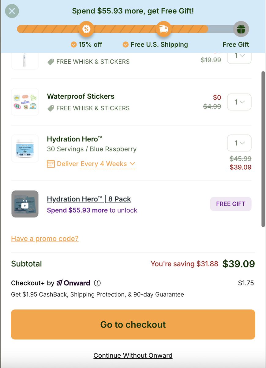
We optimized the cart drawer → Conversion skyrocketed! 🚀
Here’s what we added:
✅ Progress Bar → Gamifies the experience (users love unlocking rewards) ✅ Tiered Incentives (15% OFF → Free Shipping → Free Gift) → Motivates bigger orders ✅ Urgency & Clarity (“Spend $55.93 more to unlock”) → Drives immediate action ✅ UGC & Freebies Callouts → Boosts perceived value
Result? Higher AOV + more checkouts without extra ad spend.
CRO isn’t about big redesigns… It’s about small psychological wins stacked together. 🔑
TrueNutra is printing $$$ MILLIONS with BH MRR on Shopify.
And their risk management is almost more interesting than the funnel itself.
According to their ads?
You should ditch real pharma drugs...
And replace them with their Chinese-made supplement.
Nothing new there.
Plenty of DR brands use that playbook.
Click the ad...
And you land on a regular PDP.
No mention of subscriptions.
No mention of refills.
Nothing.
And guess what?
They're running all of this on Shopify Payments.
Crazy, right?
Not really.
Because these guys aren't betting the business on one store.
They own:
→ truenutrahealth
→ truenutrashop
→ gotruenutra
→ truenutrawellness
→ truenutraco
→ truenutraplus
→ truenutrapure
Different Shopify stores.
And I'd bet different LLCs too.
So if one store gets clipped?
Sure.
They lose those subscriptions.
But they don't stop.
Another store takes over.
New customers keep flowing in.
And if they're breakeven on the front-end?
They're still printing.
That's the difference.
Most people optimize for stability.
These guys optimize for survivability.
They actually have 2,700+ active ads right now...
And they’re quietly printing.
Guess what?
Most of the ads are native.
Long copy.
Straight to PDP.
Nothing revolutionary there.
But here’s the interesting part:
They’re selling the SAME supplement.
And positioning it for:
→ Blood pressure
https://t.co/NNdLxJaXIK
→ Joint pain
https://t.co/mg3TbNTNU1
→ Nerve pain
https://t.co/8kwV5CBAmy
And the list goes on...
Different angle.
Same bottle.
And every path leads to the same place:
A 28-day subscription.
That’s the game.
Most brands try to find one winning angle.
These guys find ten.
2,700+ ads.
Multiple pain points.
One subscription.
Do the math.
Here's the workflow we just killed inside @ecomwize:
1. Open NanoBanana, Higgsfield, or any AI tool you use for photos
2. Write a prompt
3. Wait
4. Regenerate 6 times
5. Download
6. Open Photoshop
7. Fix the product because it's a lookalike, not your actual product
8. Export
9. Open the page builder
10. Upload
11. Resize for mobile
12. Repeat for ads
We replaced it with one feature: Creative Studio.
→ Upload your product photo
→ Drop a reference image (no prompt needed)
→ Get a unique shot with your exact product in it
→ Drop straight into your landing page
Lifestyle shots, product shots, static ads for Meta. All in one place.
Just way less clicking.
RT + comment "Studio" and we'll send 300 AI credits to try it.
(Must be following)