US CPI SUMMARY⚠️
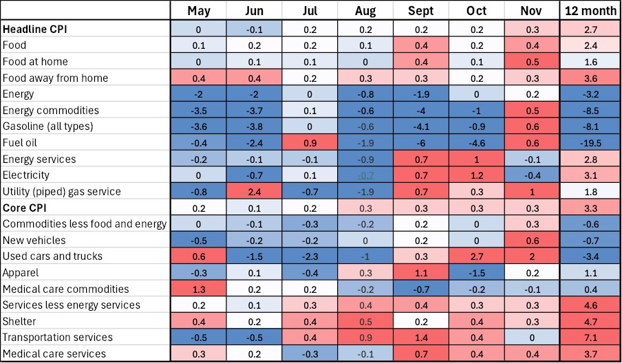
Whatever way you want to look at it, inflation progress as measured by CPI seems to have stalled. 3 month annualized rates for both core and headline inflation are well above the 2% target (and rising) and 6 month annualized readings are also picking up.
Was today’s CPI report enough to make the Fed pause? No, there were no major shocks on the day. However, they very much will be aware inflation may not be on an entirely smooth path towards 2%. This is something Powell has stated he expected to be the case to be fair.
Following today's CPI, CME FedWatch has a >98% probability of a 0.25% further cut at their meeting this month.
Headline CPI advanced 0.31% (Prev. 0.2%) in November. On a year over year basis CPI rose 2.7% (Prev. 2.6%), as expected and is at its highest since July. This is the second consecutive increase in YoY CPI.
Core CPI, which excludes more volatile energy and food, was up 0.31%. Core is up 3.3% year over year (Prev. 3.3%), in line with expectation.
3 month annualized
Core 3.7% (Prev. 3.6%)
Headline 3% (Prev. 2.5%)
6 month annualized
Core 2.9% (Prev. 2.6%)
Headline 2.1% (Prev. 1.4%)
Annualized figures are the rate at which year over year inflation would print at if the defined time period's pace was maintained for 12 months. It allows for a visualization of inflation momentum.
Overall
The rate of change seen in the last 3 months of both core and headline CPI is running well above the Fed's target.
Shelter rose 0.3% (Prev. 0.4%), which made up almost 40% of the total monthly CPI rise. This is part of CPI that Powell has said the Fed are relatively confident will cool as leases roll over. Owners equivalent rent actually advanced at the coolest pace since 1H 21. Lodging away from home advanced rapidly at 3.2% month over month and was an outlier.
New vehicles, as well as used cars and trucks advanced at a rapid pace, 0.6% and 2% month over month respectively, but remain in year over year deflation.
Core goods, which for most of the year has seen deflation, rose at 0.3%.
Having said all the above, we know core PCE is the Fed's preferred measure of inflation. It is generally more dynamic to consumer spending and places less of an emphasis on shelter than CPI.
US CPI Heatmap
Simply explained
Released by the Bureau of Labor Statistics monthly
The Consumer Price Index measures the change in prices for goods and services for urban consumers; it is a measure of inflation. To achieve this, a basket of goods and services prices is sampled monthly. The goods and services in question are supposed to reflect the spending patterns of consumers in the United States. The data is supposed to be representative of prices for over 90% of the US population.
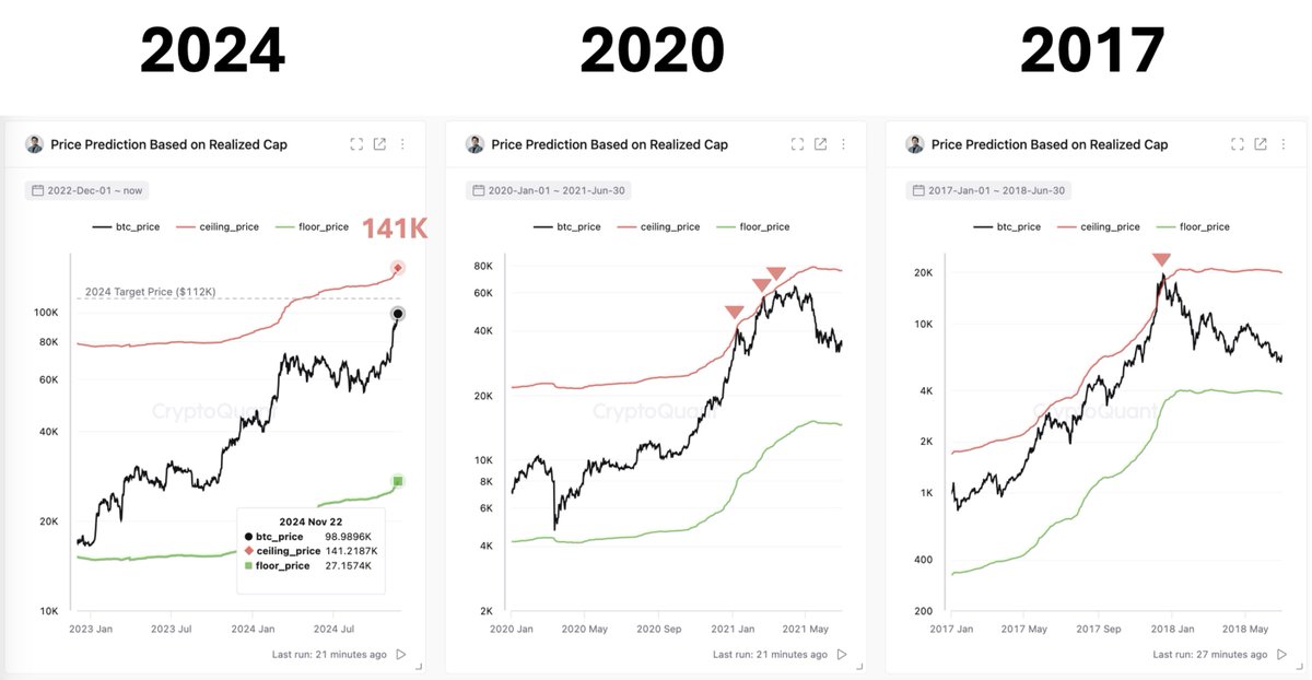
#Bitcoin market seems too early to call a bubble.
The market cap hasn’t increased significantly relative to cumulative on-chain capital inflows.
Based on the current realized cap, it could rise to $141K. The realized cap has been steadily increasing every day.
When Bitcoin hits $100,000 I will give 1 BTC to one person who follows me.
The rules are simple:
- like this tweet, follow me and RT
- comment “100k incoming”
Let’s go! $BTC #bitcoin
Tonight or tomorrow morning, think of a decision you’ve been putting off, and challenge the fuzzy “what ifs” holding you hostage. If not now, when? If left at the status quo, what will your life and stress look like in 6 months? In 1 year? In 3 years? Who around you will also suffer?
What is Stock to Flow? - explained simple
Imagine you have a collection of baseball cards. The S2F model is like a way to measure how rare and valuable your cards might be.
Stock: This is the total number of cards you have in your collection (all the baseball cards you own).
Flow: This is how many new cards you get each year (like packs you open or cards you trade for).
The rarer your cards are, the better. Here's how S2F helps:
High S2F = Rare Cards: If you have a small collection (stock) and rarely get new cards (flow), then the S2F ratio is high. This means your cards are probably more valuable because there aren't many out there.
Low S2F = Common Cards: If you have a huge collection (stock) and easily get new cards all the time (flow), then the S2F ratio is low. These cards might not be as valuable because there are so many of them.
Why is this important?
Just like rare baseball cards can be expensive, scarce assets (like some precious metals or certain cryptocurrencies) can be valuable because there's a limited supply.
The S2F ratio gives a number to compare how scarce different things are.
Things to Remember:
This model works best for things with a limited supply, not things you can easily make more of.
S2F is just one way to think about value. Other things, like how useful something is or how many people want it, also matter.
@upsidedowndata Does your charts take into account other macro data e.g. S&P500, interest rates, CPI etc, since BTC is highly corelated to SPX etc? thx
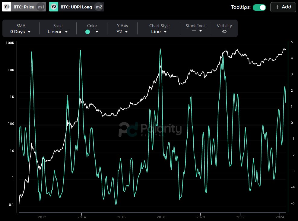
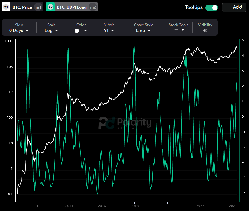
$BTC's long-term risk continues to cool off according to our UDPI risk model.
Definitely good to see, though I'd personally like to see it cool off further before getting too confident about another sustainable push up. #Bitcoin
New: The Week in Charts📈
-Inflation Heating Up
-Most Absurd # in CPI
-The Higher for Longer Impact
-Fast Food Isn't Cheap Anymore
-The Start of a Correction?
-And More...
https://t.co/qf0Ef4XCNg
The mechanics of a #Bitcoin correction can be visualised, in full colour using onchain data.
We can see smart money taking profits, and lettuce hands buying high, and selling low.
A quick and fun video covering yesterdays dip 👇
https://t.co/WIp1H3YzqG
#Bitcoin Pre-halving Dip or Doom?
In this market check-in, we will investigate whether the strong hands are holding firm, and if the fast money lettuce hands are panic selling the lows.
Newsletter: https://t.co/uqtGjjzOYc
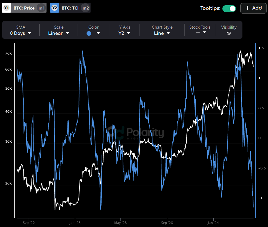
$BTC's Trend Confidence Indicator (TCI) is still trending down, suggesting continued weakness.
Until we see it reverse, I won't be getting too excited. If we avoid further downside, more sideways consolidation is probably the best we can hope for. #Bitcoin
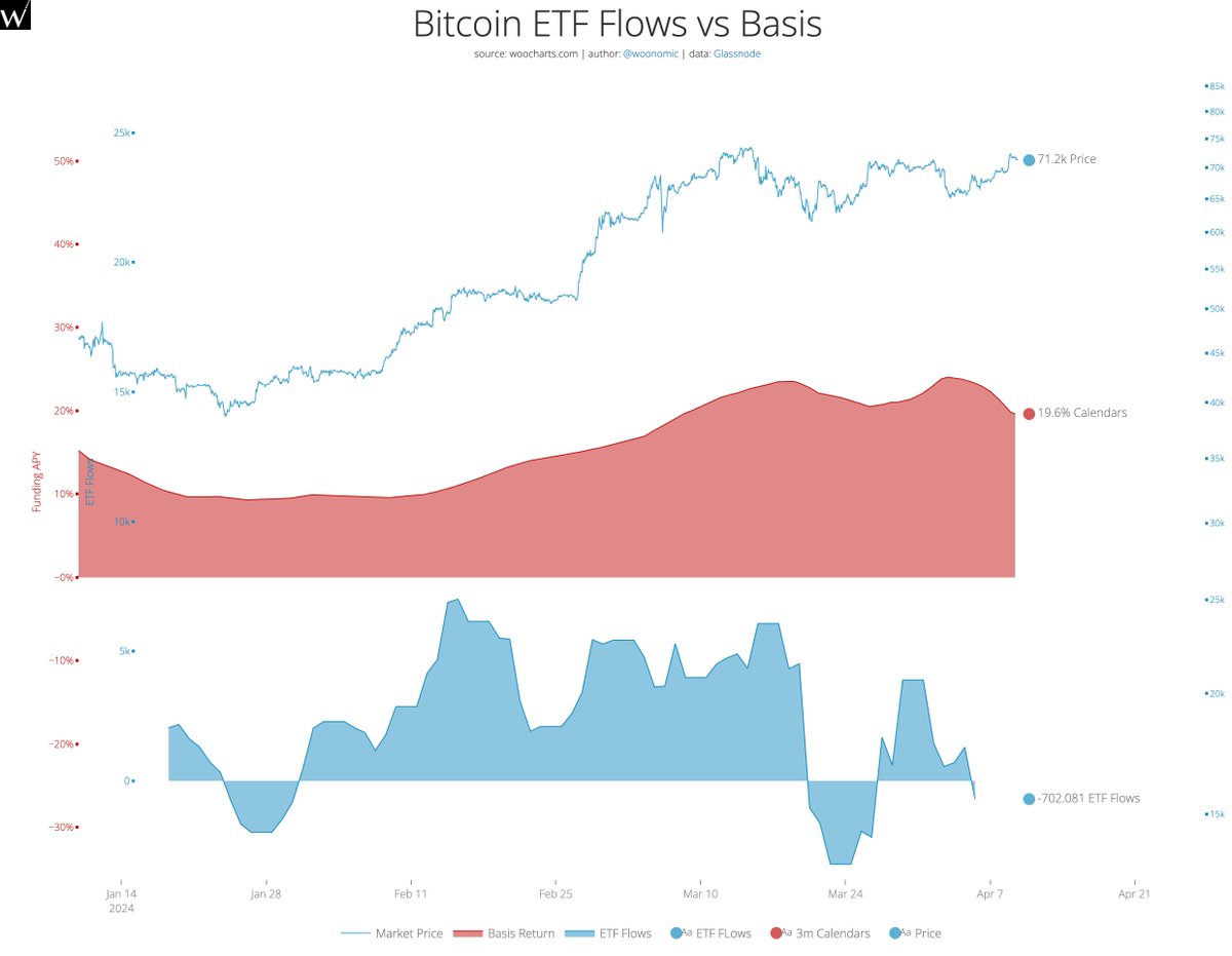
Everyone gets excited over ETF inflows thinking they are new investors, this is incorrect.
There's a carry trade between CME futures and Spot ETFs.
Hedge funds temporarily buy the ETF to hedge their carry trade.
There's outflows when they unwind their positions as yields drop
How Big are the #Bitcoin ETFs Anyway?
Latest @_checkonchain analysis is live, and we're addressing two key questions I've received a lot lately:
1) How big is the impact of the ETFs?
2) Is $GBTC really Long-Term Holder supply?
Enjoy folks!
https://t.co/SRU8oj37qB
For all of you that really want to understand the #Bitcoin ETF flows and ignore the narratives, no one does it better than @_Checkmatey_. I highly recommend you watch this video.
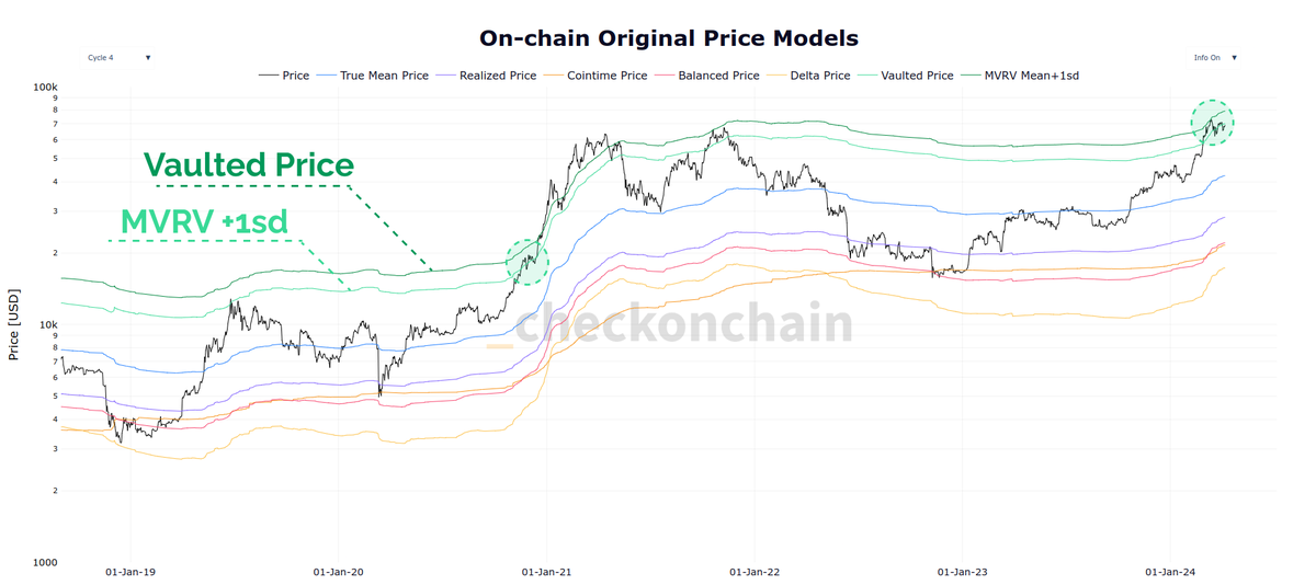
#Bitcoin is trading just below the upper pricing bands of the Onchain Originals, defined by MVRV+1sd and Vaulted Price.
The last time we were at these levels was December 2020...and...well...we all know where this goes.
This chart is collection of many of the OG Onchain pricing models, many of which were developed in the golden onchain years of 2018-20. This was a time when many of the early pioneers of the discipline were iterating off CSV downloads, and testing crazy ideas on how to value the orange coin.
Legendary time, and very nostalgic.
https://t.co/LWxvxuxmHu
We're still in wait and see mode for #Bitcoin I think.
Long-term risk remains elevated. I'd like to see this fall before thinking another push up is likely to be sustainable.
Tracking #Bitcoin market momentum can be challenging given the volatility
Many moons ago, I developed the MVRV Gradient Oscillators, which track how 'vertical' price is relative to capital inflows
Fresh @_checkonchain video, hot off the press!
https://t.co/NaHxZAsAGt