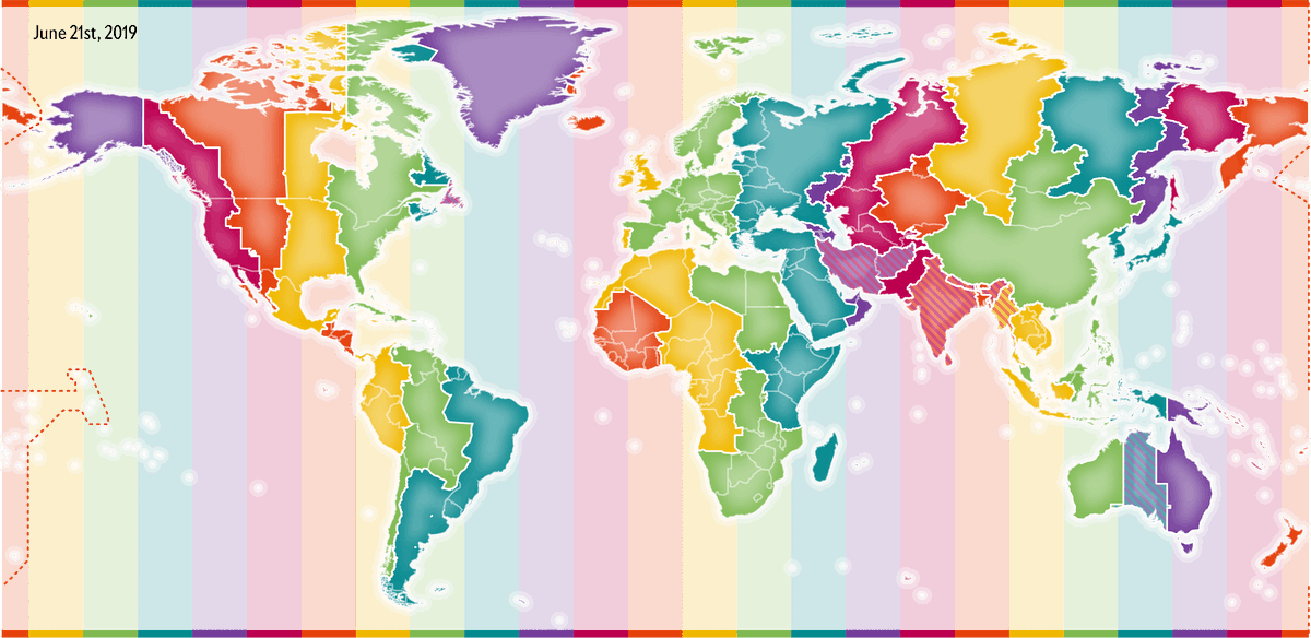
UPDATE! 🎉 I can finally reveal the up-close visuals that I made for @sciam about how Solar and "clock" noon are definitely not in sync across the planet 🌞
It even includes the "not-before-seen" winter maps!
https://t.co/vKgvUTOUcy
📈Long thread on how Prophet works📈
- Instead of sharing slides I'm transcribing my https://t.co/k2O5Z2SJSJ talk to tweets with lots of GIFs :)
- Thanks to @_bletham_ for all his help.
"People think data will solve our problems, but we invented that data, so we are the ones actually solving them. No data is perfect, nor objective; it’s actually a very subjective process." We asked @giorgialupi five questions about human elements of data. https://t.co/BlVLrmWda2
Ever wish for a way to write #d3js graphs with fewer lines of code? My latest @observablehq tutorial has you covered: exploratory dataviz of NYC Open Data using @vega_vis's Vega-Lite, featuring bars, heatmaps, small multiples, and interactive Gantt charts https://t.co/tctralSL1d
My first d3js tutorial shows how to use @observablehq with @DataToViz’s d3-annotation library to annotate your graphs. (Also featuring a sneak preview of how @vega_vis can visualize Enigma’s public data without leaving the browser) ✏️📊📈 https://t.co/bpLPlkbgI3